A few months ago I discovered the Valknut symbol. It’s a very angular trefoil knot – essentially a very sharp version of the Celtic Triquetra. (Or alternatively, it’s three linked triangles.)
It’s a very aesthetically pleasing symbol – combining the Power of Three with the mesmerising effect of an unending loop and un-untiable knot. It has rotational symmetry and is chiral.
And it’s an Anglo-Saxon and Germanic symbol (and it certainly does look very Anglo-Saxon). It’s part of English heritage. It’s unfortunate, therefore, that we don’t really see the symbol in modern life. (It’s part of a broader problem of our disconnect from the Anglo-Saxons. I’ve mentioned before that next to nothing – and sometimes literally nothing – about the Anglo-Saxons is mentioned in British schools. Most English people, I think, are completely unaware of Old English as a language – which is absurd as it’s a very nice language. Given all of this, it’s not surprising that this symbol has been forgotten about in modern life.)
So I think we should bring it back. It is a very nice symbol of the English and of Englishness, and it forms a very nice counterpart to the Celtic Triquetra (which is very well known about), given that they are just curved and angular versions of each other. (The Valknut probably needs a more English name – ‘Valknut’ is rather obviously Norse. I mean, really, it could just be called an ‘English Triquetra’, as ‘triquetra’ means ‘three corners’ – it being curved is not specified in the name. (Perhaps it could even be called a ‘Sexaquetra’ – ‘six corners’ – depending on how you want to count them – but that name doesn’t have as good of a ring to it.))
There are different ways of designing the Valknut – differences in line width and line spacing, and so on. And of course the distinction between the trefoil knot and the three linked triangles. In this post I present some designs, but I have not been exhaustive in these designs – yet – I might add more later. The style that I find to be most aesthetically pleasing is what I call the ‘close trefoil knot’ style, where the turns of the knot appear to leave almost no gaps – you’ll see what I mean if you look at some other designs. I’ve made these in a 5:3 ratio – which is a standard flag ratio – but that doesn’t really matter as they’re all just geometric shapes in the middle of a rectangle.
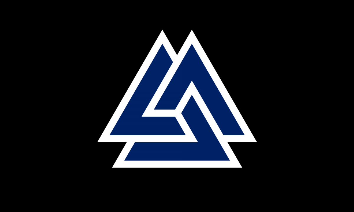
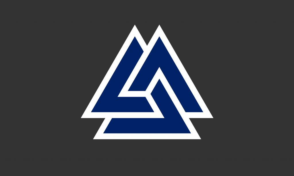
A blue on black design looks very nice – as does blue on dark grey, shown below. The blue I’ve used here is the same blue as from the Union Jack.
Blue on white also looks very good – quite minimalist, but pleasingly so.

Red on black looks a little harsh, and red on dark grey is nothing special, but red on white is very pleasing.
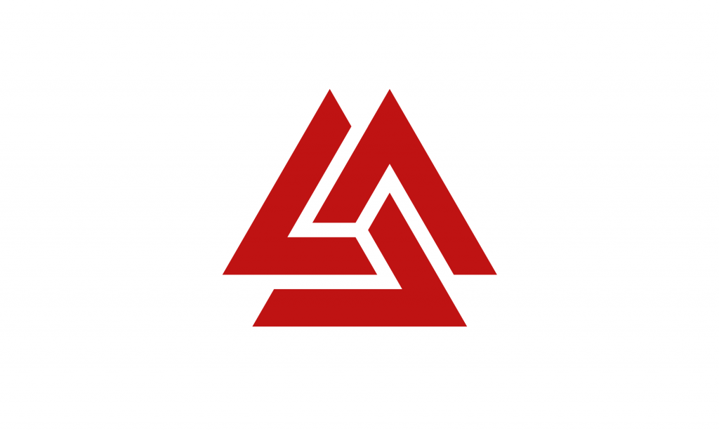
This uses the same red as from the English flag, so it makes a nice companion to it.
As I say, it would be nice to see this symbol used more widely. I think it would look very nice on British bank notes and coins. Similarly it would look great on rings and pendants. Symbolically it ties together so many things – the Anglo-Saxons and their Germanic origins, the Celtic Triquetra and Celtic knotwork, even things like the Triskelion (with Greek and Roman significance) and the Flag of the Isle of Man – it even has a passing resemblance to the symbol for the Deathly Hallows from Harry Potter. It links together many different things from thousands of years of English and British history. It could even be said to represent the three nations of Great Britain – the English, the Welsh, and the Scottish – should we so choose.
So I will try to use it more. Even just as a stamp or a sticker it’s very nice – or a background pattern. As a symbol it is simple enough, meaningful enough, and pleasant enough to be used excessively and not become tired or cliché.