More flags of the English – and flags of Wessex

Well I’m back designing flags sooner than I thought.

In my first post about a white dragon flag for the English, I said that there were other alterations to the design that I wanted to look at – and well, inspiration struck.

The most obvious alteration to make is actually just a colour change. Wessex is not a formal region of England today. The name comes from the Kingdom of Wessex – an Anglo-Saxon kingdom (the name at the time being Ƿestseaxna rice). The Anglo-Saxon kingdoms of Essex and Sussex have given their names to English counties, but not Wessex. It survives now as an informal region.

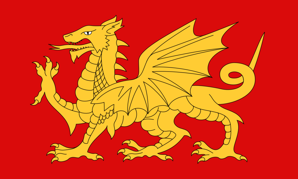
But a symbol of the Anglo-Saxons – and in particular of Wessex – is the dragon or wyvern – in particular the golden dragon or wyvern. There is a design for a flag of Wessex made in the 1970s. It features a golden wyvern on a field of red.

Now, any worthwhile fantasy author will tell you that, strictly speaking, a dragon has four legs and two wings, while a wyvern has two legs and two wings. Wyverns might, in one sense, be a bit more naturalistic, as in the real world creatures with wings tend to have lost two of their legs to get them. But I have always preferred dragons – proper, four-legged dragons. I think they just look better.

So a flag of Wessex (and I technically live in Wessex) featuring a wyvern seems a bit disappointing to me – I’d much rather a dragon. The existing flag design is also, in my opinion, not great. The lines of it are a bit all-over-the-place.

So I thought I’d just change the colours in the design I have to get a new design for a flag of Wessex.

A Flag of Wessex – (V2) – Gold on Red

I think that looks great. The gold is very nice. I made the eye white – that just didn’t look right as gold. The red here is hsl(0, 90%, 45%) – a strong, primary red. The gold is hsl(45, 100%, 60%).

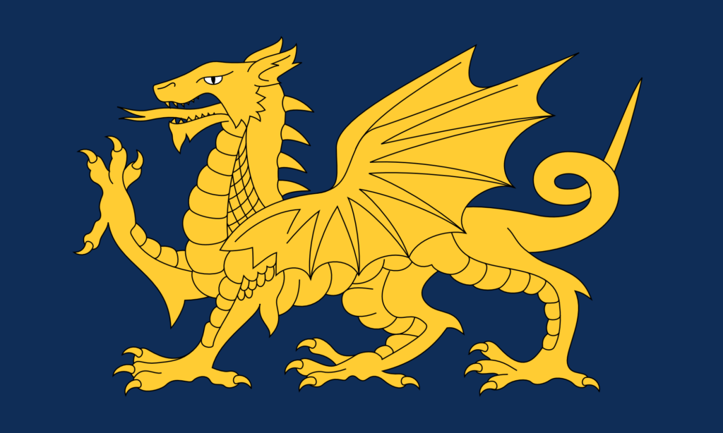
I thought it would look good with a dark blue background too.

A Flag of Wessex – (V2) – Gold on Blue

And it does. I think that looks even better. This blue is hsl(215, 70%, 20%).

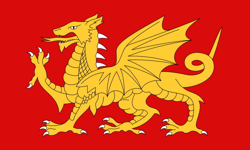
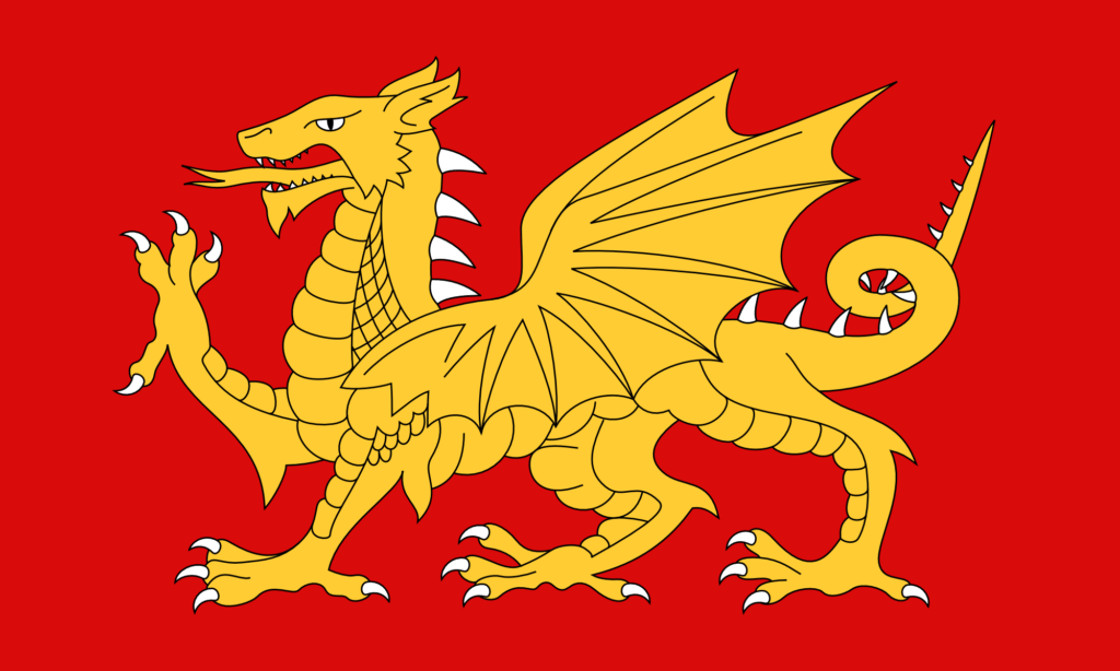
It occurred to me that it’s quite odd not to have the claws, spines, and teeth be white too. (On the Welsh flag they’re all red, like the rest of the dragon – it doesn’t look odd until you notice it.) The original file I had had done some strange things with the paths, so I had to do a bit of geometry before I could change the colour of the claws.

A Flag of Wessex – (V2) – Gold on Red with White Claws

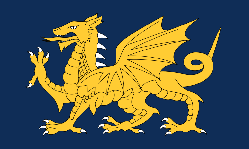
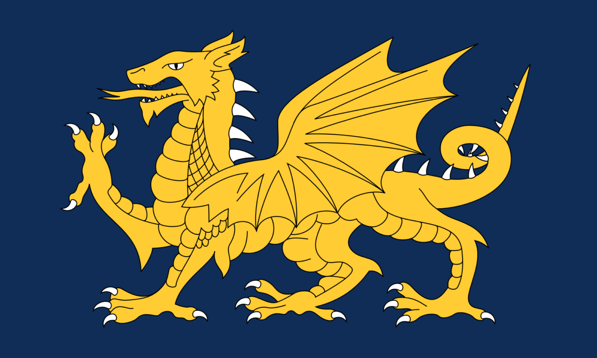
And it just looks amazing in blue.

A Flag of Wessex – (V2) – Gold on Blue with White Claws

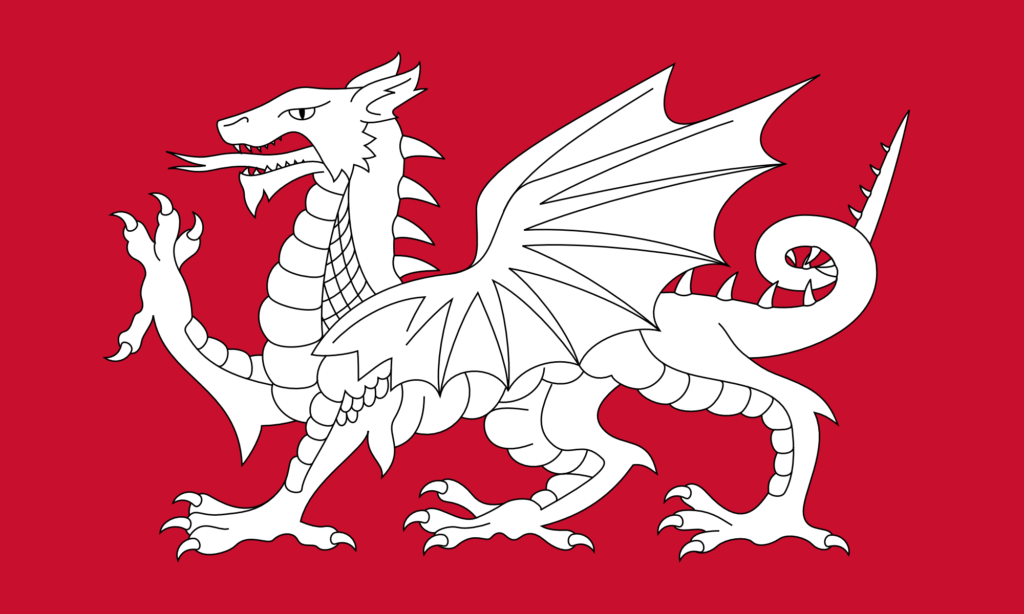
I also wanted to make some more changes to the base design of the dragon. There are lots that I could do, but I started with the simplest one, which is just to add more spines. In more naturalistic depictions, dragons often have spines going all the way along the tail.

A Flag of the English – (V3) – With more spines

And then of course why not do this design in the Wessex colours too?

A Flag of Wessex – (V3) – Gold on Red with White Claws
A Flag of Wessex – (V3) – Gold on Blue with White Claws

This final one I think is my favourite. The white of the claws, spines, and teeth adds interesting highlights to the design without really adding any more complexity. Having the white spines go all the way along the tail adds more balance to the right-hand side of the design. And the gold looks fantastic against the blue.

There are even more changes I want to make – particularly to the shape of the wing, and to the scales – but I will save those for another time.

A Flag of the English – The White Dragon Flag

I have always been tremendously jealous of the Welsh flag. It’s got a dragon on it – it looks fantastic.

The English flag, by comparison, is rather plain – a red cross on white. Plainness is generally quite a good thing in flag design – it means the flag is easily recognisable and easily reproducible. But still – who doesn’t want a dragon? Dragon flags look fantastic. The flag of Bhutan has a dragon on it, and it looks amazing. The flag of the Qing dynasty also had a dragon on it, and that looks even better – a truly outstanding flag design – much better than the current Chinese flag – they should consider going back to it.

Why can’t we have a dragon on our flag? Well the thing is … we could. The symbolism of the red dragon on the Welsh flag goes back to Arthurian legend. A red dragon and a white dragon are locked in combat, with the red dragon representing the native Britons (the Celts) – now the Welsh – and the white dragon representing the Anglo-Saxons – now the English. So a white dragon is a symbol of the English.

This is fairly well known – lots of people already know this, and lots of people have already had the idea of making a white dragon flag to represent the English. (I mean, you could argue the idea never went away from Anglo-Saxon times – the Kingdom of Wessex used a golden dragon as its symbol (still on the flag of Wessex today, though as a wyvern (the distinction being somewhat unimportant here)), and the flag of Somerset also features a dragon.) But the idea has not spread very far – partly I think just because of a lack of awareness of the symbol, but also because of a lack of good designs. A good design propagates on its own.

So for a while now I’ve thought it would be good to make some designs for an English White Dragon flag – an unofficial flag as an alternative to the St. George’s Cross.

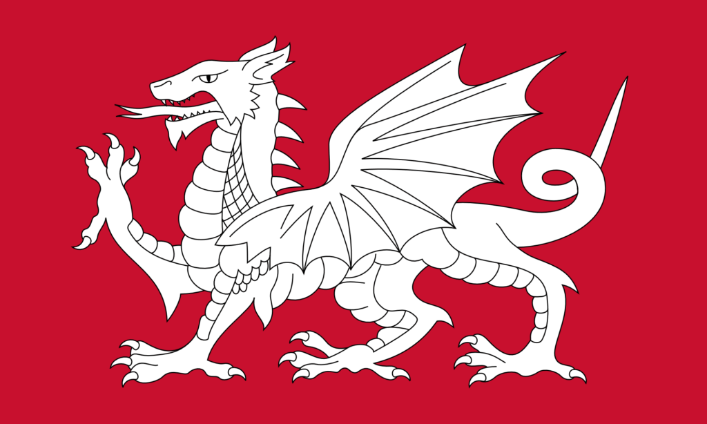
The simplest thing to do is just to change the colours on the Welsh flag, as shown below. (I am most certainly not the first person to do this – you can see that others have already done it just with a quick internet search.)

This is the exact same design as the Welsh flag – it just uses the red of the dragon from the Welsh flag as the background, and then the dragon itself is pure white. The design is incredibly striking – I think actually even more so than the Welsh flag.

This design also looks fantastic with a black background.

As with my design for a flag of Wiltshire (featuring a white horse), I find myself torn between different styles of illustration. The dragon on the Welsh flag is obviously very stylised – it’s not just a dragon, it’s a heraldic dragon. I particularly like heraldry and I quite like the heraldic style of illustration, but I do think there are some things that are a bit odd about the design here.

I have never liked what I call the ‘demon’s tail’ style of tail that the design above has. Almost every cartoon drawing of a demon has a tail like that. Personally I think it would look better if it were more naturalistic. That goes for the dragon’s tongue too.

I have also never liked the ‘nose horn’ of the dragon. This seems like a rather odd place to have a horn (that is, a forward-pointing one). In more naturalistic depictions of dragons – which are rather common nowadays thanks to CGI – you never see this. (It’s a remarkable thing that, with decades of stories and movies about dragons, we now have a very strong collective understanding of what a dragon is supposed to look like.)

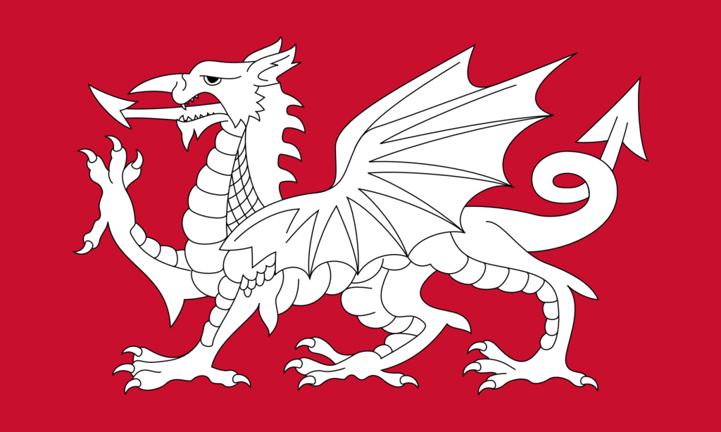
So I set about modifying the above design. The result is below.

As with my design for a white horse flag for Wiltshire, I found that there were so many things to agonise over while making this design.

I wanted to make some improvements to the design, but I also wanted to retain much of the style – the heraldic style – of the original design. Of course, here we’re not dealing with a purely mathematical design – we’re dealing with freeform paths that can be given any shape. Should this control point go here? Should I move it slightly? Is that a better curve? That looks good, but does it deviate from the style too much? I agonised for hours and hours over it. I am not really certain about most of it, but at some point you just have to decide that it’s done.

I have removed the ‘demon’s tail’. I have also changed the tongue. Now, I’ve given it a forked tongue – that’s sort of a bit of a problem because of course a forked tongue typically carries the symbolism of the snake and of deception. That’s not the intended meaning here, of course – the aim is just to be naturalistic.

I have removed the nose horn, and elongated the dragon’s face. I think this is a tremendous improvement – again, more naturalistic – but of course it does lose some of that heraldic style. I have changed the eye quite substantially – making it a bit meaner. The eye on the original design makes the dragon look a bit dopey. I have also adjusted its spines – and I think this is the only change that I’m completely sure of.

There are so many other things I could have changed (adding more spines along the tail, changing the wings to be a bit more anatomical, changing the ears to look a bit more reptilian, and so on), but of course that risks losing some of the style. As with my white horse flag for Wiltshire, I consider this to just be Version 1 – I may make other versions in future with more modifications. I would also like to make some versions that don’t use the heraldic design at all – and which use something a bit more ‘modern’, for lack of a better word.

So we English can have a dragon on our flag, and it looks rather good. As ever, I don’t suggest making this the official flag – it’s just nice to have as an unofficial one. I’ll be getting some of these made for myself.

Why I’m going back to B.C. / A.D.

When I first found out about B.C.E. / C.E. – standing for ‘Before the Common Era’ and ‘Common Era’ – which I think was towards the end of primary school or sometime during secondary school, I immediately found them compelling. I’d say for most of the time between 2006 and 2023, I used B.C.E. / C.E. exclusively instead of B.C. / A.D.. But now I’m going back.

You have to remember that Christianity in England was different in the late 90s and early 2000s. Nowadays, Christianity is absent from most parts of English life (if you’re an atheist like me) – a result, in part, of New Atheism (of which I was a small part). But 20-25 years ago it was much more present. More people were Christian, and they were more vocal about it – more willing to mention it in casual conversation; more willing to make their allegiance to it known.

I was an atheist from a very early age – possibly six, seven, eight years old. It was very obvious to me, early on, that there was no particular reason to believe in the existence of the Christian god over, say, the Greek gods. I recognised it straight away as mythology.

I also have a rebellious streak, and a great disdain for condescension and that kind of ‘kid-talk’ voice that bad primary school teachers do. The Christians I encountered in the late 90s and early 2000s were extremely condescending, and also quite bossy and expectant. So I found Christianity to not only be incorrect, but also detestable.

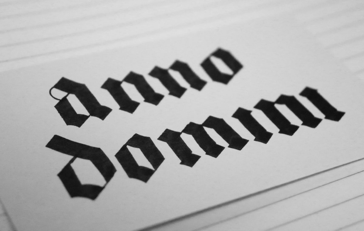
This is why I liked B.C.E. / C.E.. As an atheist, it seemed nonsensical to write an abbreviation meaning ‘Before Christ’ when I don’t believe that Jesus of Nazareth was Christ (i.e., the son of a god), or to write an abbreviation of ‘Anno Domini’, meaning ‘in the year of our Lord’, when I don’t believe that Jesus was or is Lord. I also disliked that our year-numbering system was connected to – what I saw as – a very annoying religion filled with quite annoying people.

B.C.E. / C.E., on the other hand, seemed perfectly clear and neutral – abstract even. ‘The Common Era’ – a term that seemed to make sense given that people right across the world used this numbering system – it really was the common era. I was also drawn to the symmetry of the abbreviations – both containing ‘C.E.’. It seems elegant. That’s the physicist / programmer in me – we are drawn to symmetry and the simplification it brings.

So for many years I consistently used B.C.E. / C.E. every time I needed to write it. But now I’m changing back.

There are several reasons for this. Primary among them is that I abhor the obscuration of history and the loss of tradition. I have always abhorred these things – from a very young age. This isn’t a new trait. (It is something that has long set me apart from a lot of the people on the political left, who generally see no value in tradition – be it national tradition or even local or personal tradition.) And the reality is, the B.C.E. / C.E. system uses the same numbers as the B.C. / A.D. system – numbers which, for centuries, were used to denote how many years had passed since the birth of Jesus of Nazareth. (Whether or not they are accurate is a different matter – that is the meaning they had for centuries.) If any young person, new to all of this, were to ask ‘Why are the year numbers the numbers that they are? Why is the current year 2024 and not 3748?’, you would have to explain that they are based on the number of years thought to have passed since the birth of Jesus of Nazareth. So changing the words doesn’t actually remove the meaning at all – the meaning is still there. All changing the words does is try to obscure the origin of the system – it just tries to obscure a historical fact. And I don’t like that.

Also, as time has gone on, I have gotten a greater and greater adoration for old things. I used to hate old buildings – including churches. They always stank of old building – and it’s quite an oppressive smell. This was true of churches, but also think of old pavilions on village cricket greens or football fields, or municipal libraries built in the 70s and fitted with scratchy, grey carpet tiles. Somehow they all smelled the same – of old. And they were cold – both in temperature and in lighting. I was thoroughly a modernist in this regard – I like super-modern buildings made out of shiny steel and huge glass windows.

But this was before I had really encountered the horrors of brutalism. Brutalism will make you rethink your entire attitude to modern buildings. And really, even the things that aren’t brutalist that have been built over the last 50-70 years or so are also, often, just horrid. They are ugly, stale, corporate, and bureaucratic.

Nowadays, when I go to a new town or city, the place I want to visit is the cathedral or the biggest church. They are by far the nicest-looking buildings, and the ones with the most history. I love wandering through the parts of them where all of the in-church graves and memorials are, and reading things that were carved into the wall hundreds of years ago. (It’s why Westminster Abbey is so much fun – I’d recommend to everyone to go there.)

I adore the things that have lasted for centuries – buildings, statues, artwork, and also conventions, such as B.C. / A.D.. These things connect you to the past – a past, and a society, in which all of your ancestors lived. By writing B.C. / A.D., you are participating in a system that thousands upon thousands of people have used before you. By using it, you are joining them in upholding an ancient tradition. You are passing on what was passed down to you.

And in the end, the literal meaning doesn’t really matter to me. Simply writing B.C. / A.D. – or even the full wording – has no chance of changing my mind about the existence of a supernatural being. Atheism (for me, at least) is not so flimsy.

(As an aside, I did previously wonder whether there was a technical reason to switch to B.C.E. / C.E. – that being the ‘blip’ caused by the switch between Old Style and New Style dates resulting from the change from the Julian Calendar to the Gregorian Calendar. The B.C. / A.D. system, being defined from a time 2024 years ago, could be used to refer to either an Old Style or a New Style date. The B.C.E. / C.E. system – I thought – was defined from now backwards, and thus could only ever refer to a New Style date. This would have made the Common Era system more mathematically rigorous. However, I later found that this wasn’t true – B.C.E. / C.E. is just a wholesale swap-out for B.C. / A.D., with no mathematical fix implied. What rubbish. If you’re going to make the change, at least fix the mathematics of it.)

B.C.E. / C.E. are cold – devoid of all meaning and richness. They are dreary – the kind of dreariness exhibited by brown glass windows, balding civil servants, and – worst of all places – business parks (a kind of dreariness that women in HR dream of inflicting upon their prisoner-employees).

So I’m going back to B.C. / A.D.. In fact I might quite often write out the full thing: before Christ and anno Domini. In fact in fact, I might go as far as to write out their full Latin and longer variants: ante Christum natum and anno Domini nostri Jesu Christi. After all, I do enjoy writing conventions that seem unusually lengthy and detailed.