More flags of the English – and flags of Wessex

Well I’m back designing flags sooner than I thought.

In my first post about a white dragon flag for the English, I said that there were other alterations to the design that I wanted to look at – and well, inspiration struck.

The most obvious alteration to make is actually just a colour change. Wessex is not a formal region of England today. The name comes from the Kingdom of Wessex – an Anglo-Saxon kingdom (the name at the time being Ƿestseaxna rice). The Anglo-Saxon kingdoms of Essex and Sussex have given their names to English counties, but not Wessex. It survives now as an informal region.

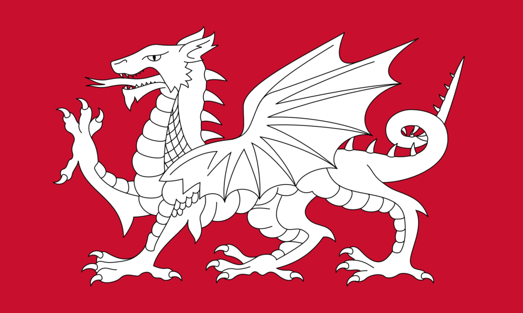
But a symbol of the Anglo-Saxons – and in particular of Wessex – is the dragon or wyvern – in particular the golden dragon or wyvern. There is a design for a flag of Wessex made in the 1970s. It features a golden wyvern on a field of red.

Now, any worthwhile fantasy author will tell you that, strictly speaking, a dragon has four legs and two wings, while a wyvern has two legs and two wings. Wyverns might, in one sense, be a bit more naturalistic, as in the real world creatures with wings tend to have lost two of their legs to get them. But I have always preferred dragons – proper, four-legged dragons. I think they just look better.

So a flag of Wessex (and I technically live in Wessex) featuring a wyvern seems a bit disappointing to me – I’d much rather a dragon. The existing flag design is also, in my opinion, not great. The lines of it are a bit all-over-the-place.

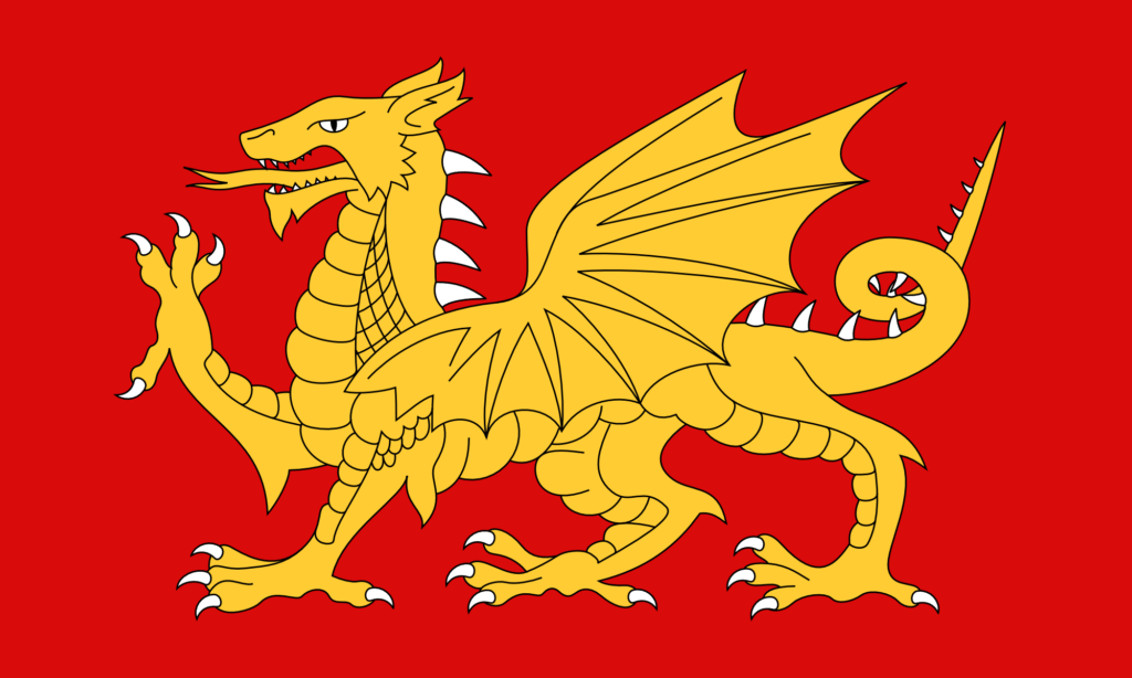
So I thought I’d just change the colours in the design I have to get a new design for a flag of Wessex.

A Flag of Wessex – (V2) – Gold on Red

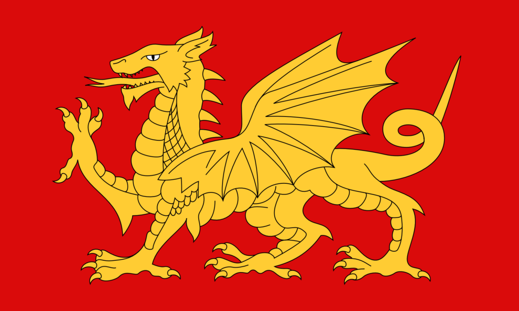
I think that looks great. The gold is very nice. I made the eye white – that just didn’t look right as gold. The red here is hsl(0, 90%, 45%) – a strong, primary red. The gold is hsl(45, 100%, 60%).

I thought it would look good with a dark blue background too.

A Flag of Wessex – (V2) – Gold on Blue

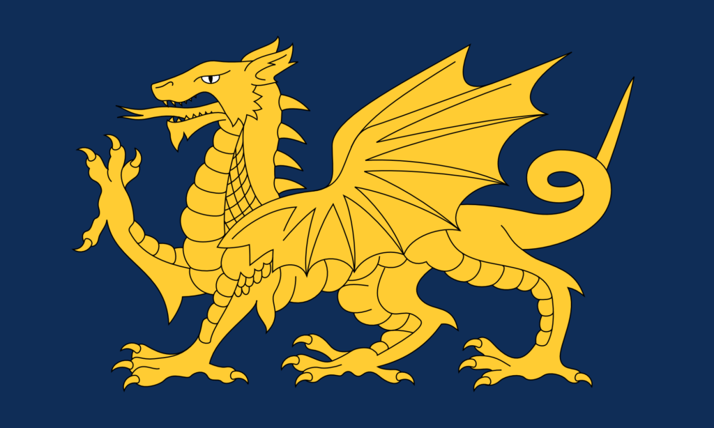
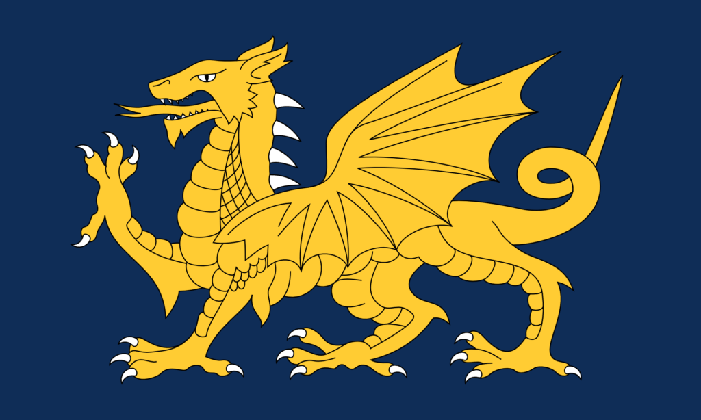
And it does. I think that looks even better. This blue is hsl(215, 70%, 20%).

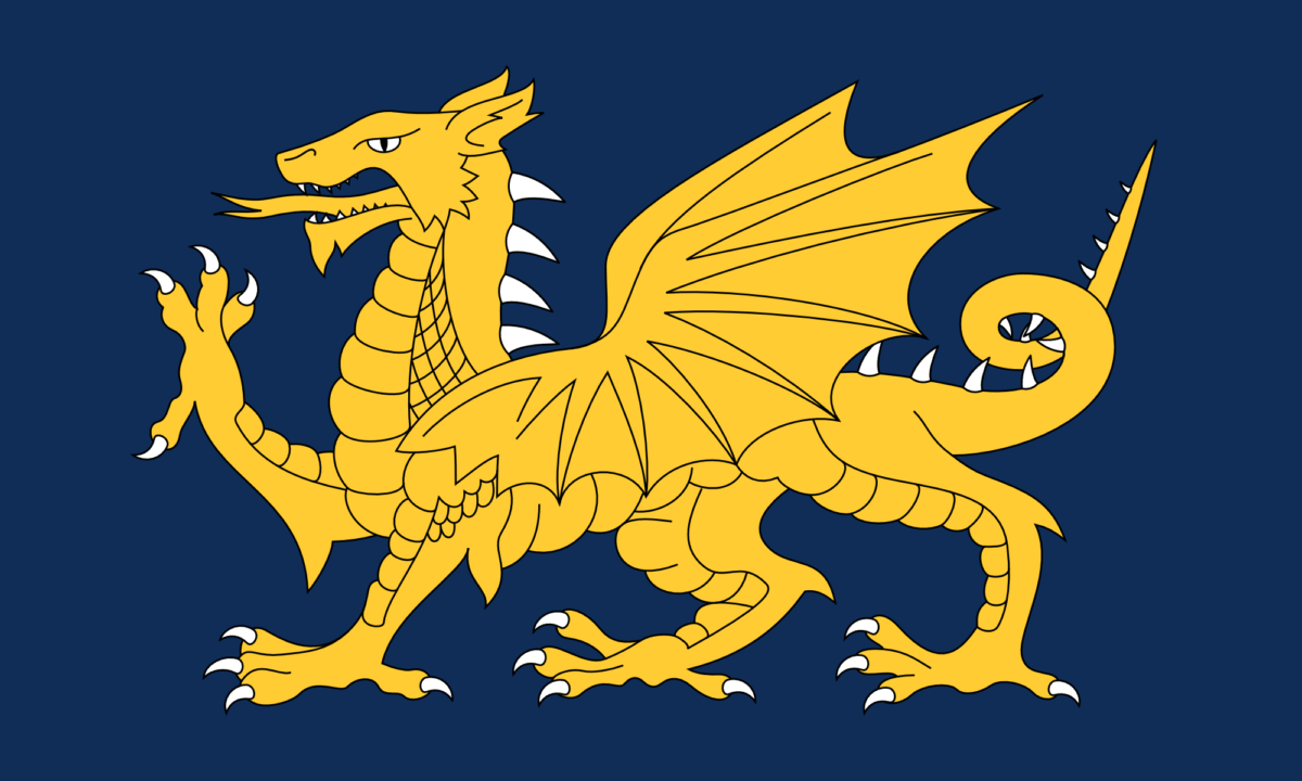
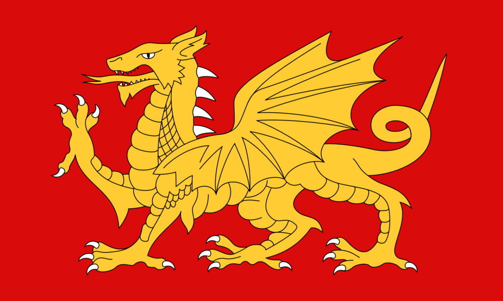
It occurred to me that it’s quite odd not to have the claws, spines, and teeth be white too. (On the Welsh flag they’re all red, like the rest of the dragon – it doesn’t look odd until you notice it.) The original file I had had done some strange things with the paths, so I had to do a bit of geometry before I could change the colour of the claws.

A Flag of Wessex – (V2) – Gold on Red with White Claws

And it just looks amazing in blue.

A Flag of Wessex – (V2) – Gold on Blue with White Claws

I also wanted to make some more changes to the base design of the dragon. There are lots that I could do, but I started with the simplest one, which is just to add more spines. In more naturalistic depictions, dragons often have spines going all the way along the tail.

A Flag of the English – (V3) – With more spines

And then of course why not do this design in the Wessex colours too?

A Flag of Wessex – (V3) – Gold on Red with White Claws
A Flag of Wessex – (V3) – Gold on Blue with White Claws

This final one I think is my favourite. The white of the claws, spines, and teeth adds interesting highlights to the design without really adding any more complexity. Having the white spines go all the way along the tail adds more balance to the right-hand side of the design. And the gold looks fantastic against the blue.

There are even more changes I want to make – particularly to the shape of the wing, and to the scales – but I will save those for another time.

Valknut Flags

A few months ago I discovered the Valknut symbol. It’s a very angular trefoil knot – essentially a very sharp version of the Celtic Triquetra. (Or alternatively, it’s three linked triangles.)

It’s a very aesthetically pleasing symbol – combining the Power of Three with the mesmerising effect of an unending loop and un-untiable knot. It has rotational symmetry and is chiral.

And it’s an Anglo-Saxon and Germanic symbol (and it certainly does look very Anglo-Saxon). It’s part of English heritage. It’s unfortunate, therefore, that we don’t really see the symbol in modern life. (It’s part of a broader problem of our disconnect from the Anglo-Saxons. I’ve mentioned before that next to nothing – and sometimes literally nothing – about the Anglo-Saxons is mentioned in British schools. Most English people, I think, are completely unaware of Old English as a language – which is absurd as it’s a very nice language. Given all of this, it’s not surprising that this symbol has been forgotten about in modern life.)

So I think we should bring it back. It is a very nice symbol of the English and of Englishness, and it forms a very nice counterpart to the Celtic Triquetra (which is very well known about), given that they are just curved and angular versions of each other. (The Valknut probably needs a more English name – ‘Valknut’ is rather obviously Norse. I mean, really, it could just be called an ‘English Triquetra’, as ‘triquetra’ means ‘three corners’ – it being curved is not specified in the name. (Perhaps it could even be called a ‘Sexaquetra’ – ‘six corners’ – depending on how you want to count them – but that name doesn’t have as good of a ring to it.))

There are different ways of designing the Valknut – differences in line width and line spacing, and so on. And of course the distinction between the trefoil knot and the three linked triangles. In this post I present some designs, but I have not been exhaustive in these designs – yet – I might add more later. The style that I find to be most aesthetically pleasing is what I call the ‘close trefoil knot’ style, where the turns of the knot appear to leave almost no gaps – you’ll see what I mean if you look at some other designs. I’ve made these in a 5:3 ratio – which is a standard flag ratio – but that doesn’t really matter as they’re all just geometric shapes in the middle of a rectangle.

A blue on black design looks very nice – as does blue on dark grey, shown below. The blue I’ve used here is the same blue as from the Union Jack.

A blue on dark grey version – the blue is the same blue as from the Union Jack.

Blue on white also looks very good – quite minimalist, but pleasingly so.

A blue on white version – again, the blue is the same blue as from the Union Jack.

Red on black looks a little harsh, and red on dark grey is nothing special, but red on white is very pleasing.

A red on white version – this is the same red as from the Flag of England – the St. George’s Cross.

This uses the same red as from the English flag, so it makes a nice companion to it.

As I say, it would be nice to see this symbol used more widely. I think it would look very nice on British bank notes and coins. Similarly it would look great on rings and pendants. Symbolically it ties together so many things – the Anglo-Saxons and their Germanic origins, the Celtic Triquetra and Celtic knotwork, even things like the Triskelion (with Greek and Roman significance) and the Flag of the Isle of Man – it even has a passing resemblance to the symbol for the Deathly Hallows from Harry Potter. It links together many different things from thousands of years of English and British history. It could even be said to represent the three nations of Great Britain – the English, the Welsh, and the Scottish – should we so choose.

So I will try to use it more. Even just as a stamp or a sticker it’s very nice – or a background pattern. As a symbol it is simple enough, meaningful enough, and pleasant enough to be used excessively and not become tired or cliché.