More flags of the English – and flags of Wessex

Well I’m back designing flags sooner than I thought.

In my first post about a white dragon flag for the English, I said that there were other alterations to the design that I wanted to look at – and well, inspiration struck.

The most obvious alteration to make is actually just a colour change. Wessex is not a formal region of England today. The name comes from the Kingdom of Wessex – an Anglo-Saxon kingdom (the name at the time being Ƿestseaxna rice). The Anglo-Saxon kingdoms of Essex and Sussex have given their names to English counties, but not Wessex. It survives now as an informal region.

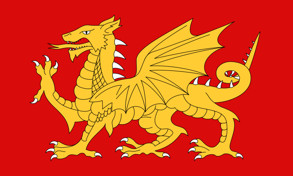
But a symbol of the Anglo-Saxons – and in particular of Wessex – is the dragon or wyvern – in particular the golden dragon or wyvern. There is a design for a flag of Wessex made in the 1970s. It features a golden wyvern on a field of red.

Now, any worthwhile fantasy author will tell you that, strictly speaking, a dragon has four legs and two wings, while a wyvern has two legs and two wings. Wyverns might, in one sense, be a bit more naturalistic, as in the real world creatures with wings tend to have lost two of their legs to get them. But I have always preferred dragons – proper, four-legged dragons. I think they just look better.

So a flag of Wessex (and I technically live in Wessex) featuring a wyvern seems a bit disappointing to me – I’d much rather a dragon. The existing flag design is also, in my opinion, not great. The lines of it are a bit all-over-the-place.

So I thought I’d just change the colours in the design I have to get a new design for a flag of Wessex.
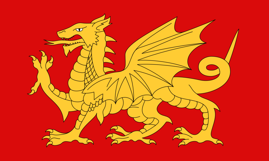
A Flag of Wessex – (V2) – Gold on Red

I think that looks great. The gold is very nice. I made the eye white – that just didn’t look right as gold. The red here is hsl(0, 90%, 45%) – a strong, primary red. The gold is hsl(45, 100%, 60%).

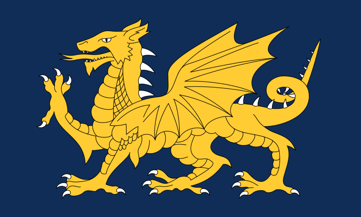
I thought it would look good with a dark blue background too.
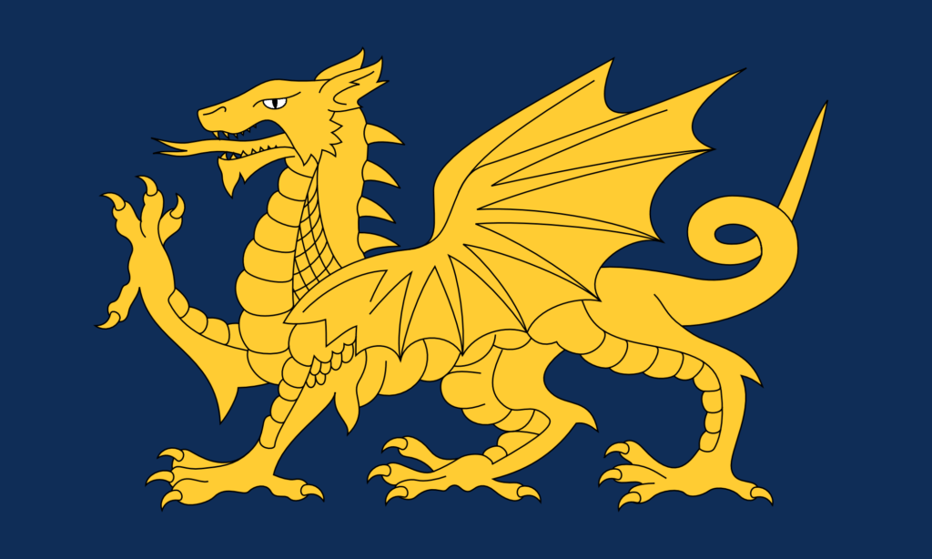
A Flag of Wessex – (V2) – Gold on Blue

And it does. I think that looks even better. This blue is hsl(215, 70%, 20%).

It occurred to me that it’s quite odd not to have the claws, spines, and teeth be white too. (On the Welsh flag they’re all red, like the rest of the dragon – it doesn’t look odd until you notice it.) The original file I had had done some strange things with the paths, so I had to do a bit of geometry before I could change the colour of the claws.
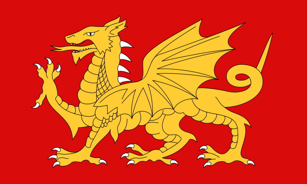
A Flag of Wessex – (V2) – Gold on Red with White Claws

And it just looks amazing in blue.

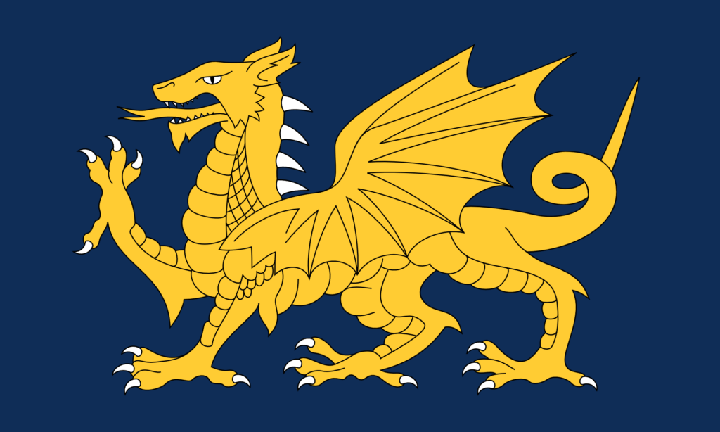
A Flag of Wessex – (V2) – Gold on Blue with White Claws

I also wanted to make some more changes to the base design of the dragon. There are lots that I could do, but I started with the simplest one, which is just to add more spines. In more naturalistic depictions, dragons often have spines going all the way along the tail.
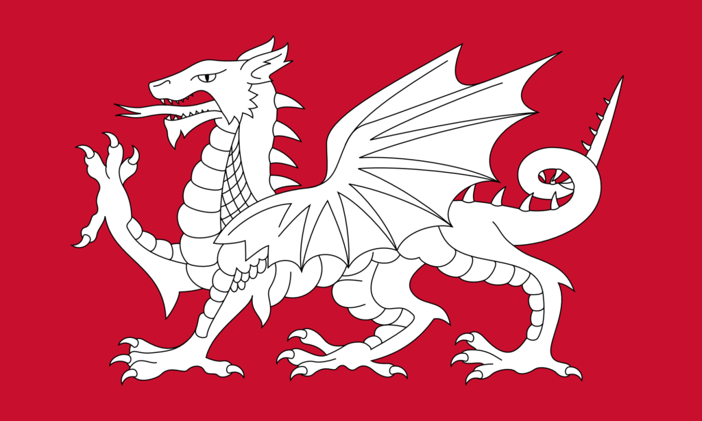
A Flag of the English – (V3) – With more spines

And then of course why not do this design in the Wessex colours too?
A Flag of Wessex – (V3) – Gold on Red with White Claws
A Flag of Wessex – (V3) – Gold on Blue with White Claws

This final one I think is my favourite. The white of the claws, spines, and teeth adds interesting highlights to the design without really adding any more complexity. Having the white spines go all the way along the tail adds more balance to the right-hand side of the design. And the gold looks fantastic against the blue.

There are even more changes I want to make – particularly to the shape of the wing, and to the scales – but I will save those for another time.
A Flag of the English – The White Dragon Flag

I have always been tremendously jealous of the Welsh flag. It’s got a dragon on it – it looks fantastic.

The English flag, by comparison, is rather plain – a red cross on white. Plainness is generally quite a good thing in flag design – it means the flag is easily recognisable and easily reproducible. But still – who doesn’t want a dragon? Dragon flags look fantastic. The flag of Bhutan has a dragon on it, and it looks amazing. The flag of the Qing dynasty also had a dragon on it, and that looks even better – a truly outstanding flag design – much better than the current Chinese flag – they should consider going back to it.

Why can’t we have a dragon on our flag? Well the thing is … we could. The symbolism of the red dragon on the Welsh flag goes back to Arthurian legend. A red dragon and a white dragon are locked in combat, with the red dragon representing the native Britons (the Celts) – now the Welsh – and the white dragon representing the Anglo-Saxons – now the English. So a white dragon is a symbol of the English.

This is fairly well known – lots of people already know this, and lots of people have already had the idea of making a white dragon flag to represent the English. (I mean, you could argue the idea never went away from Anglo-Saxon times – the Kingdom of Wessex used a golden dragon as its symbol (still on the flag of Wessex today, though as a wyvern (the distinction being somewhat unimportant here)), and the flag of Somerset also features a dragon.) But the idea has not spread very far – partly I think just because of a lack of awareness of the symbol, but also because of a lack of good designs. A good design propagates on its own.

So for a while now I’ve thought it would be good to make some designs for an English White Dragon flag – an unofficial flag as an alternative to the St. George’s Cross.

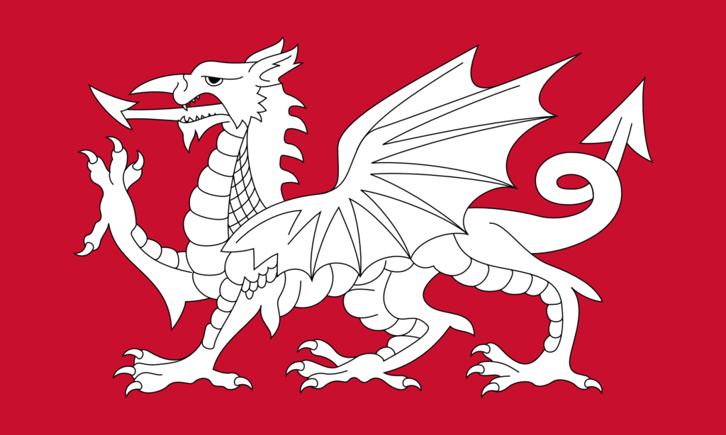
The simplest thing to do is just to change the colours on the Welsh flag, as shown below. (I am most certainly not the first person to do this – you can see that others have already done it just with a quick internet search.)

This is the exact same design as the Welsh flag – it just uses the red of the dragon from the Welsh flag as the background, and then the dragon itself is pure white. The design is incredibly striking – I think actually even more so than the Welsh flag.

This design also looks fantastic with a black background.

As with my design for a flag of Wiltshire (featuring a white horse), I find myself torn between different styles of illustration. The dragon on the Welsh flag is obviously very stylised – it’s not just a dragon, it’s a heraldic dragon. I particularly like heraldry and I quite like the heraldic style of illustration, but I do think there are some things that are a bit odd about the design here.

I have never liked what I call the ‘demon’s tail’ style of tail that the design above has. Almost every cartoon drawing of a demon has a tail like that. Personally I think it would look better if it were more naturalistic. That goes for the dragon’s tongue too.

I have also never liked the ‘nose horn’ of the dragon. This seems like a rather odd place to have a horn (that is, a forward-pointing one). In more naturalistic depictions of dragons – which are rather common nowadays thanks to CGI – you never see this. (It’s a remarkable thing that, with decades of stories and movies about dragons, we now have a very strong collective understanding of what a dragon is supposed to look like.)

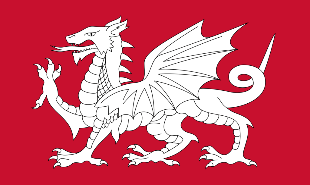
So I set about modifying the above design. The result is below.

As with my design for a white horse flag for Wiltshire, I found that there were so many things to agonise over while making this design.

I wanted to make some improvements to the design, but I also wanted to retain much of the style – the heraldic style – of the original design. Of course, here we’re not dealing with a purely mathematical design – we’re dealing with freeform paths that can be given any shape. Should this control point go here? Should I move it slightly? Is that a better curve? That looks good, but does it deviate from the style too much? I agonised for hours and hours over it. I am not really certain about most of it, but at some point you just have to decide that it’s done.

I have removed the ‘demon’s tail’. I have also changed the tongue. Now, I’ve given it a forked tongue – that’s sort of a bit of a problem because of course a forked tongue typically carries the symbolism of the snake and of deception. That’s not the intended meaning here, of course – the aim is just to be naturalistic.

I have removed the nose horn, and elongated the dragon’s face. I think this is a tremendous improvement – again, more naturalistic – but of course it does lose some of that heraldic style. I have changed the eye quite substantially – making it a bit meaner. The eye on the original design makes the dragon look a bit dopey. I have also adjusted its spines – and I think this is the only change that I’m completely sure of.

There are so many other things I could have changed (adding more spines along the tail, changing the wings to be a bit more anatomical, changing the ears to look a bit more reptilian, and so on), but of course that risks losing some of the style. As with my white horse flag for Wiltshire, I consider this to just be Version 1 – I may make other versions in future with more modifications. I would also like to make some versions that don’t use the heraldic design at all – and which use something a bit more ‘modern’, for lack of a better word.

So we English can have a dragon on our flag, and it looks rather good. As ever, I don’t suggest making this the official flag – it’s just nice to have as an unofficial one. I’ll be getting some of these made for myself.

Symbolomania – The obsession with symbolism over reality

By all means, accuse me of inventing too many words with the suffix ‘-mania’, but I do find it to be infinitely useful.

The year is 2019. The month is May. Fans of fantasy all around the world gather to watch the final episode of Game of Thrones.

Daenerys Targaryen has, inexplicably, gone mad. Jon Snow decides to kill her. Drogon, her dragon, after seeing this, decides to attack … the Iron Throne.

It makes no sense. Dragons in this world, while unable to speak or communicate telepathically as they can in some other fantasy worlds, are supposedly ferociously intelligent. There is no way that Drogon doesn’t know that it was Jon Snow who killed Daenerys. Dragons are also vicious, and rather indifferent to humans other than the ones they are bound to in some way. Drogon would kill Jon Snow. That would make sense.

But instead the dragon attacks … the chair. Why? It’s a chair. What does it mean to a dragon? Unless of course, Drogon somehow knows what the chair symbolises – the desire for power, and all the infighting it causes. Drogon, in this moment, gains a meta-level understanding of the world he’s in. He momentarily becomes the audience, and that’s why he attacks the symbol and impetus of the show.

For a show that is supposed to be realist, this is ridiculous. It only happens because the writers think it’s profound, and that profundity takes precedence over physical and logical realism. It is one of the many reasons why the show is considered a car crash, and why people hardly ever talk about it now, despite it being one of the most popular shows in the world for about a decade.

In the subsequent years, I have seen this obsession with symbols many other times. I have seen people be obsessed with the symbolism of something – what they think it means – regardless of the actual logical, physical, or logistical consequences of something, regardless of reality.

I won’t enumerate all of the examples, as that would make this post unbearably long, but I will focus on one: royalty.

I am a royalist. It’s actually one of the few ‘-ist’ words I will actually apply to myself. I’ll save a full explanation of why I’m a royalist for another post, but it’s worth saying that being a royalist does not mean that you support or are in favour of every single thing every single member of the royal family does all the time. It means you are in favour of the concept of royalty.

In any discussion on royalty, one of the arguments against it you’ll hear quite often and quite early on is ‘I don’t think anyone should be considered “better” than anyone else.’ – in other words, they see the meaning of ‘royalty’ as being that some people in society should be higher up, higher in status, more important, intrinsically more moral people – better.

It’s a weird argument, because I don’t think anyone who is a royalist today actually believes that members of the royal family are better, more worthy, than the rest of us. I think royalists just see the royal family as inheritors of an ancient tradition who have a life-long duty to preserve a substantial proportion of our cultural heritage. That does not make them better, or more worthy. They are not necessarily more moral people, nor should they escape justice when justice is needed. Now sure, we should expect higher standards of them than we do of most people, since they are the inheritors of this legacy, and the performers of its rituals, but this does not mean they are necessarily better.

I think the people who see royalty as some kind of status of intrinsic superiority are obsessed with what they believe the symbolism of royalty is rather than the practical, real effects that we see in society as a result of them (or even, indeed, a truer, actual symbolism, rather than a false interpretation). In that sense they are the same as the writers of Game of Thrones (and the very small number of people who actually liked that final episode).

So I find I need a word to describe this phenomenon. I choose symbolomania – the obsession with symbols or symbolism – usually a perceived symbolism – over reality or over a more logical understanding of something.