The most obvious alteration to make is actually just a colour change. Wessex is not a formal region of England today. The name comes from the Kingdom of Wessex – an Anglo-Saxon kingdom (the name at the time being Ƿestseaxna rice). The Anglo-Saxon kingdoms of Essex and Sussex have given their names to English counties, but not Wessex. It survives now as an informal region.
But a symbol of the Anglo-Saxons – and in particular of Wessex – is the dragon or wyvern – in particular the golden dragon or wyvern. There is a design for a flag of Wessex made in the 1970s. It features a golden wyvern on a field of red.
Now, any worthwhile fantasy author will tell you that, strictly speaking, a dragon has four legs and two wings, while a wyvern has two legs and two wings. Wyverns might, in one sense, be a bit more naturalistic, as in the real world creatures with wings tend to have lost two of their legs to get them. But I have always preferred dragons – proper, four-legged dragons. I think they just look better.
So a flag of Wessex (and I technically live in Wessex) featuring a wyvern seems a bit disappointing to me – I’d much rather a dragon. The existing flag design is also, in my opinion, not great. The lines of it are a bit all-over-the-place.
So I thought I’d just change the colours in the design I have to get a new design for a flag of Wessex.
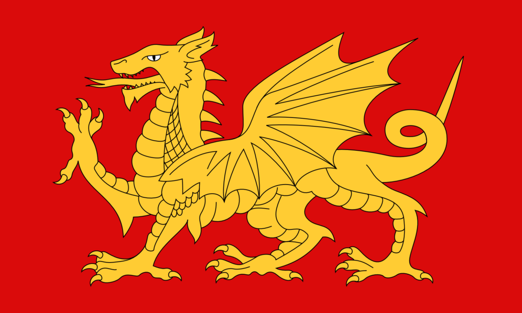
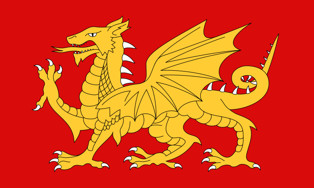
A Flag of Wessex – (V2) – Gold on Red
I think that looks great. The gold is very nice. I made the eye white – that just didn’t look right as gold. The red here is hsl(0, 90%, 45%) – a strong, primary red. The gold is hsl(45, 100%, 60%).
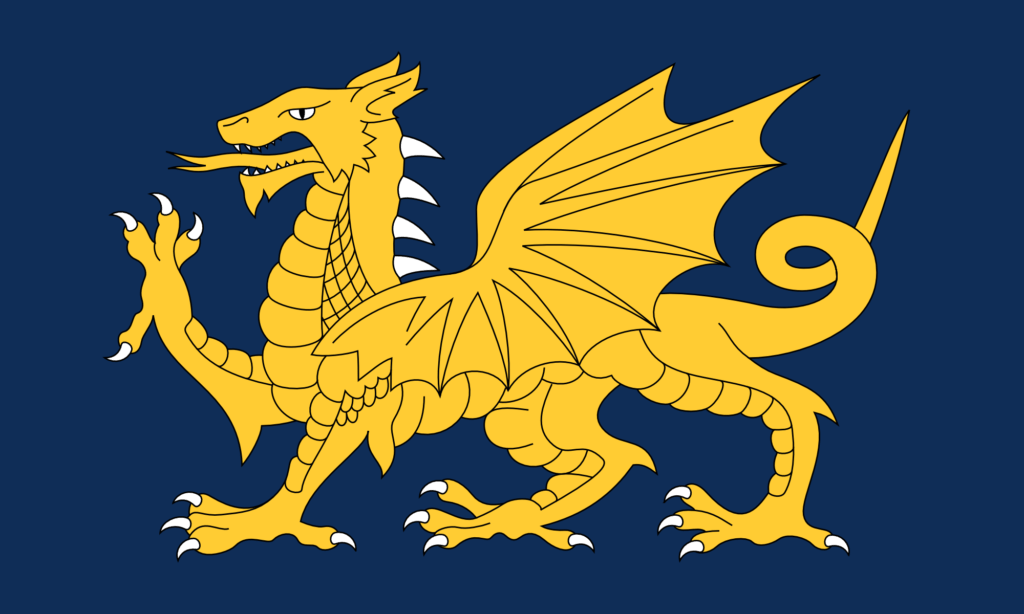
I thought it would look good with a dark blue background too.
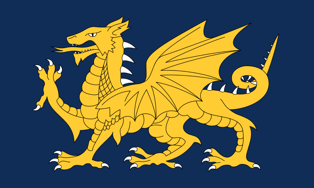
A Flag of Wessex – (V2) – Gold on Blue
And it does. I think that looks even better. This blue is hsl(215, 70%, 20%).
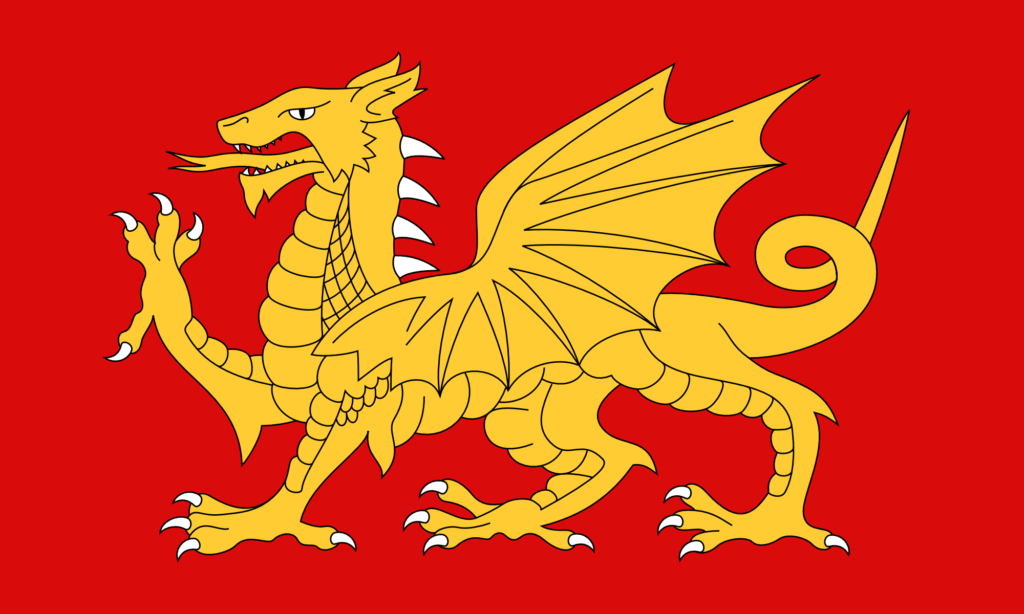
It occurred to me that it’s quite odd not to have the claws, spines, and teeth be white too. (On the Welsh flag they’re all red, like the rest of the dragon – it doesn’t look odd until you notice it.) The original file I had had done some strange things with the paths, so I had to do a bit of geometry before I could change the colour of the claws.
A Flag of Wessex – (V2) – Gold on Red with White Claws
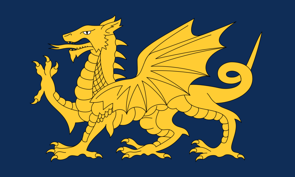
And it just looks amazing in blue.
A Flag of Wessex – (V2) – Gold on Blue with White Claws
I also wanted to make some more changes to the base design of the dragon. There are lots that I could do, but I started with the simplest one, which is just to add more spines. In more naturalistic depictions, dragons often have spines going all the way along the tail.
A Flag of the English – (V3) – With more spines
And then of course why not do this design in the Wessex colours too?
A Flag of Wessex – (V3) – Gold on Red with White ClawsA Flag of Wessex – (V3) – Gold on Blue with White Claws
This final one I think is my favourite. The white of the claws, spines, and teeth adds interesting highlights to the design without really adding any more complexity. Having the white spines go all the way along the tail adds more balance to the right-hand side of the design. And the gold looks fantastic against the blue.
There are even more changes I want to make – particularly to the shape of the wing, and to the scales – but I will save those for another time.
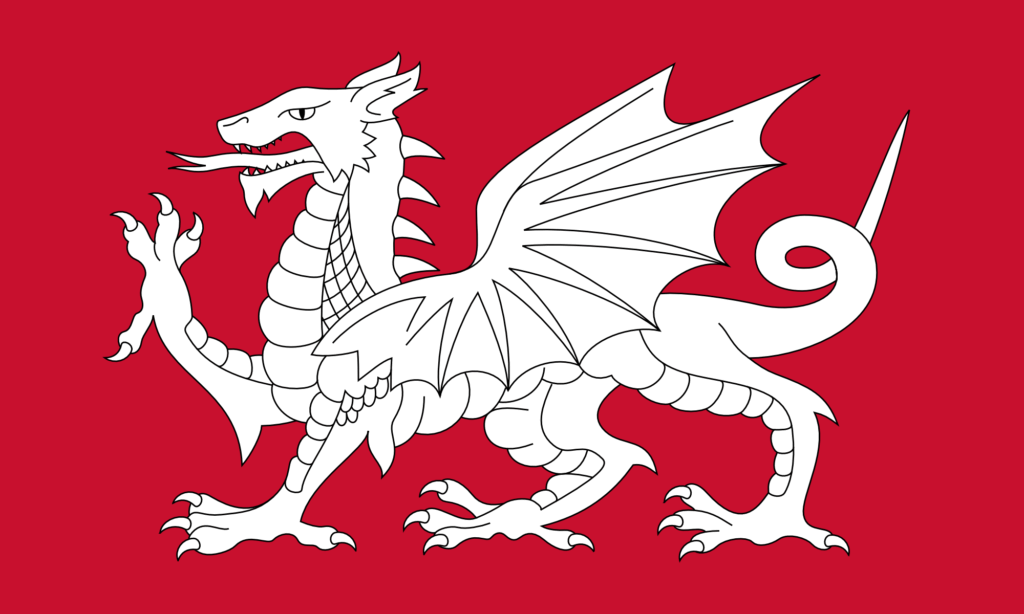
I have always been tremendously jealous of the Welsh flag. It’s got a dragon on it – it looks fantastic.
The English flag, by comparison, is rather plain – a red cross on white. Plainness is generally quite a good thing in flag design – it means the flag is easily recognisable and easily reproducible. But still – who doesn’t want a dragon? Dragon flags look fantastic. The flag of Bhutan has a dragon on it, and it looks amazing. The flag of the Qing dynasty also had a dragon on it, and that looks even better – a truly outstanding flag design – much better than the current Chinese flag – they should consider going back to it.
Why can’t we have a dragon on our flag? Well the thing is … we could. The symbolism of the red dragon on the Welsh flag goes back to Arthurian legend. A red dragon and a white dragon are locked in combat, with the red dragon representing the native Britons (the Celts) – now the Welsh – and the white dragon representing the Anglo-Saxons – now the English. So a white dragon is a symbol of the English.
This is fairly well known – lots of people already know this, and lots of people have already had the idea of making a white dragon flag to represent the English. (I mean, you could argue the idea never went away from Anglo-Saxon times – the Kingdom of Wessex used a golden dragon as its symbol (still on the flag of Wessex today, though as a wyvern (the distinction being somewhat unimportant here)), and the flag of Somerset also features a dragon.) But the idea has not spread very far – partly I think just because of a lack of awareness of the symbol, but also because of a lack of good designs. A good design propagates on its own.
So for a while now I’ve thought it would be good to make some designs for an English White Dragon flag – an unofficial flag as an alternative to the St. George’s Cross.
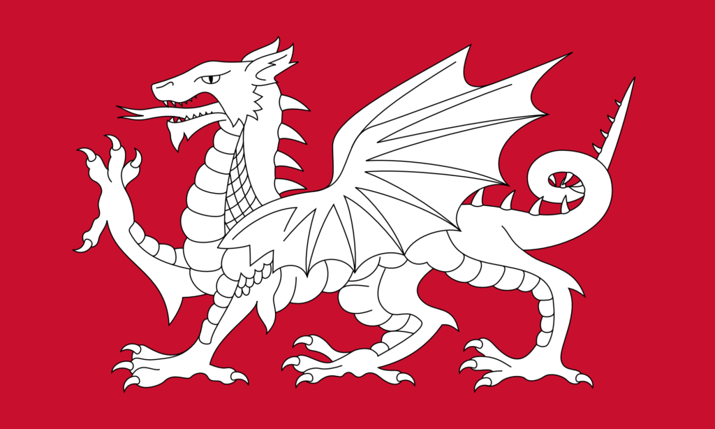
The simplest thing to do is just to change the colours on the Welsh flag, as shown below. (I am most certainly not the first person to do this – you can see that others have already done it just with a quick internet search.)
This is the exact same design as the Welsh flag – it just uses the red of the dragon from the Welsh flag as the background, and then the dragon itself is pure white. The design is incredibly striking – I think actually even more so than the Welsh flag.
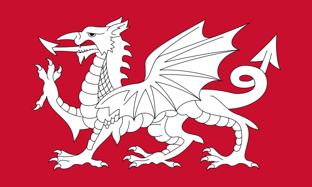
This design also looks fantastic with a black background.
As with my design for a flag of Wiltshire (featuring a white horse), I find myself torn between different styles of illustration. The dragon on the Welsh flag is obviously very stylised – it’s not just a dragon, it’s a heraldic dragon. I particularly like heraldry and I quite like the heraldic style of illustration, but I do think there are some things that are a bit odd about the design here.
I have never liked what I call the ‘demon’s tail’ style of tail that the design above has. Almost every cartoon drawing of a demon has a tail like that. Personally I think it would look better if it were more naturalistic. That goes for the dragon’s tongue too.
I have also never liked the ‘nose horn’ of the dragon. This seems like a rather odd place to have a horn (that is, a forward-pointing one). In more naturalistic depictions of dragons – which are rather common nowadays thanks to CGI – you never see this. (It’s a remarkable thing that, with decades of stories and movies about dragons, we now have a very strong collective understanding of what a dragon is supposed to look like.)
So I set about modifying the above design. The result is below.
As with my design for a white horse flag for Wiltshire, I found that there were so many things to agonise over while making this design.
I wanted to make some improvements to the design, but I also wanted to retain much of the style – the heraldic style – of the original design. Of course, here we’re not dealing with a purely mathematical design – we’re dealing with freeform paths that can be given any shape. Should this control point go here? Should I move it slightly? Is that a better curve? That looks good, but does it deviate from the style too much? I agonised for hours and hours over it. I am not really certain about most of it, but at some point you just have to decide that it’s done.
I have removed the ‘demon’s tail’. I have also changed the tongue. Now, I’ve given it a forked tongue – that’s sort of a bit of a problem because of course a forked tongue typically carries the symbolism of the snake and of deception. That’s not the intended meaning here, of course – the aim is just to be naturalistic.
I have removed the nose horn, and elongated the dragon’s face. I think this is a tremendous improvement – again, more naturalistic – but of course it does lose some of that heraldic style. I have changed the eye quite substantially – making it a bit meaner. The eye on the original design makes the dragon look a bit dopey. I have also adjusted its spines – and I think this is the only change that I’m completely sure of.
There are so many other things I could have changed (adding more spines along the tail, changing the wings to be a bit more anatomical, changing the ears to look a bit more reptilian, and so on), but of course that risks losing some of the style. As with my white horse flag for Wiltshire, I consider this to just be Version 1 – I may make other versions in future with more modifications. I would also like to make some versions that don’t use the heraldic design at all – and which use something a bit more ‘modern’, for lack of a better word.
So we English can have a dragon on our flag, and it looks rather good. As ever, I don’t suggest making this the official flag – it’s just nice to have as an unofficial one. I’ll be getting some of these made for myself.
I was born in Wiltshire, and I have lived in the county for the majority of my life. I have a very long ancestry here – I can trace my ancestry back over 400 years in just one town. (And it certainly goes back further than that – 400 years is just what I’ve been able to trace.) Various branches of the family tree spread out across the county.
There is, if you didn’t know, an official flag of Wiltshire. All (or at least most – I haven’t checked) of the English counties have flags. The Wiltshire one was designed in the 2000s by Mike Prior. I’m not overly enthusiastic about the design: curved green and white stripes, with a green circle in the middle and a golden great bustard (a bird native to Wiltshire) on top. (I like the great bustard, but I just don’t quite like the shapes in the rest of it.)
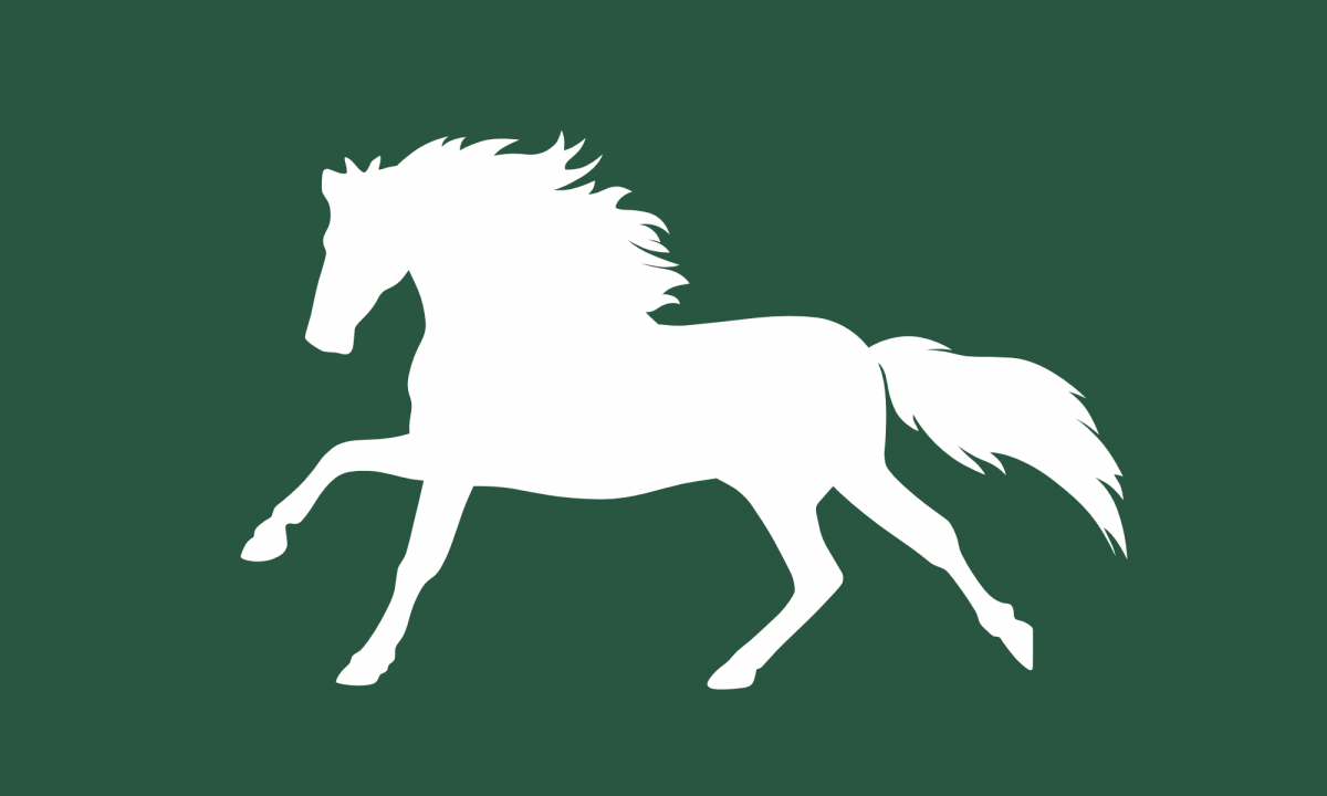
I’ve known for a while that there has been an alternate flag design – an unofficial one. It features a white horse on a field of green. It is a reference to the many white horse figures that can be seen on hillsides throughout the county – Wiltshire has the most white horses of any county. This seems like a much more fitting symbol of the county than stripes and the great bustard. (Of course, Wiltshire doesn’t have the Uffington White Horse figure – the original, prehistoric white horse figure, which is about 2000-3000 years old. That’s in Oxfordshire, in the Vale of the White Horse. But that hill figure is less than 10 miles away from the border of Wiltshire – the Vale of the White Horse itself bordering Wiltshire, of course.)
This unofficial white horse flag was apparently also designed in the 2000s, by Chris Fear. While I like the idea of a flag of Wiltshire featuring a white horse, I’m not too enthusiastic about this specific design either. It’s based on the Cherhill White Horse – which is a white horse hill figure that’s located in the county. But that hill figure looks a little peculiar – in fact it almost looks more like a deer than a horse. Symbolism is extremely important (in flags, but also in anything artistic), but I think a bit of creative licence is also valuable in order to make a design that’s really distinctive (and, with luck, iconic).
So recently I’ve been thinking: why not make a new design? A new design of a white horse on a green field, but one which is a bit more … horsey – and, dare I say, dramatic … expressive …
It’s taken me a while to get round to doing it, but now I’ve done it, and the design is below.
A Flag of Wiltshire – The White Horse Flag – Version 1
I found this very difficult to do. There were many choices to be made when making the design. What pose should the horse be in? How stylised should the design be? How detailed should it be? What colour green should I use?
I decided to have the horse running. Most of the hill figures show the horse standing, but I think that’s not quite dramatic or exciting enough for a flag. A horse running looks quite majestic.
Flag design – particularly flag design for English counties – is connected to, or even part of, heraldry. Heraldry has its own conventions and style. When drawing animals in heraldry (well, when drawing anything, really), there’s a certain style to how its drawn. It might have been nice to do that here, but I’m not sufficiently well versed in that style to be able to do it. In fact, I’m not sufficiently well versed in any style to be able to make a stylised illustration. So the design is very literal, and flat. There’s a danger that that can make something look a bit corporate (and looking corporate must be avoided at all costs), but I think the result is a simplicity that is easy to recognise, and easy to replicate. I have heard that a good flag design should be something that a child could draw from memory by hand.
Lots of flags nowadays – particularly country flags – have mathematical specifications for how they should look. It’s easy to see why countries do this – if the design is specified mathematically, there can be no arguments about whether any one copy of the flag is correct. Doing this is much easier with geometric designs, of course – it’s quite easy to do this with the Flag of England, the Flag of Scotland, the Union Jack, and countless others. But this kind of mathematical specification is somewhat at odds with traditional heraldry. In traditional heraldry, figures and shapes are defined descriptively, not mathematically, and colours are certainly not defined in a universal way. The design is allowed to vary. With the design above, any number of small changes could be made to the outline of the horse without it looking substantially different, so this kind of flag naturally resists mathematical definition. In some ways that’s a good thing – it puts the flag a bit more in line with traditional heraldry – but in some ways its a bad thing – it is hard (or impossible) to replicate the design exactly unless you have the original.
The horse figure on the flag is, of course, pure white. Choosing a green was difficult. When you really get into it, green is actually quite a difficult colour. There are so many different hues and shades of green, and they all carry with them their own connections, meanings, and moods. The exact green that I’ve chosen here has a hue of 150, a saturation of 35, and a lightness of 25. That makes it a bluish green (which I generally prefer myself, but which I think also has a very classic look to it). To me it is reminiscent of wet grass or foliage in autumn or winter. It is a deep, retreating green suitable for one of the most rural counties in the country.
While I like this design, I am not entirely convinced that it is what I intended when I set out on this project. Perhaps I would prefer something different? Perhaps there are slight refinements that I could have made, but which I overlooked? I can spend forever and a day contemplating designs like this and still not come to any conclusions about them. So rather than have this thing sit on my computer for years while I ponder it, I’m just going to label this one ‘Version 1’, and if I decide that actually I want to do something differently, I’ll come back later and do a version 2, version 3, and so on.
I do not intend for this flag to necessarily replace the existing official flag. I simply wanted to have the design, and allow other people to have it as well. How can we know what flag design we really want unless we have some options to choose between? I’m a huge fan of having unofficial versions of things that exist alongside the official versions – unofficial national anthems (like Rule, Britannia! and Land of Hope and Glory), unofficial national symbols – and in this case unofficial flags. We don’t just have to have one thing, the official thing.
So this is Version 1. I may come back later and make some different versions, but I think this version is simple, yet elegant, and majestic – distinctive, easily recognisable, and easy to like. I’ll get a few made for myself.
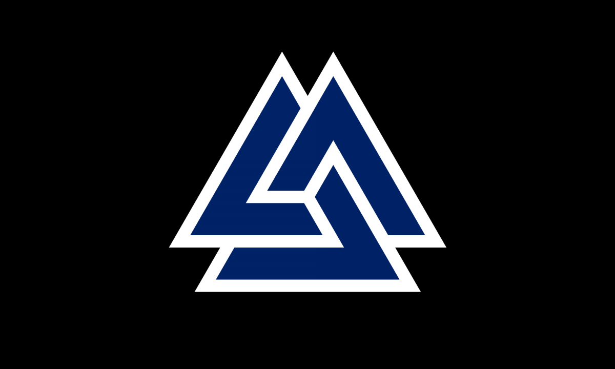
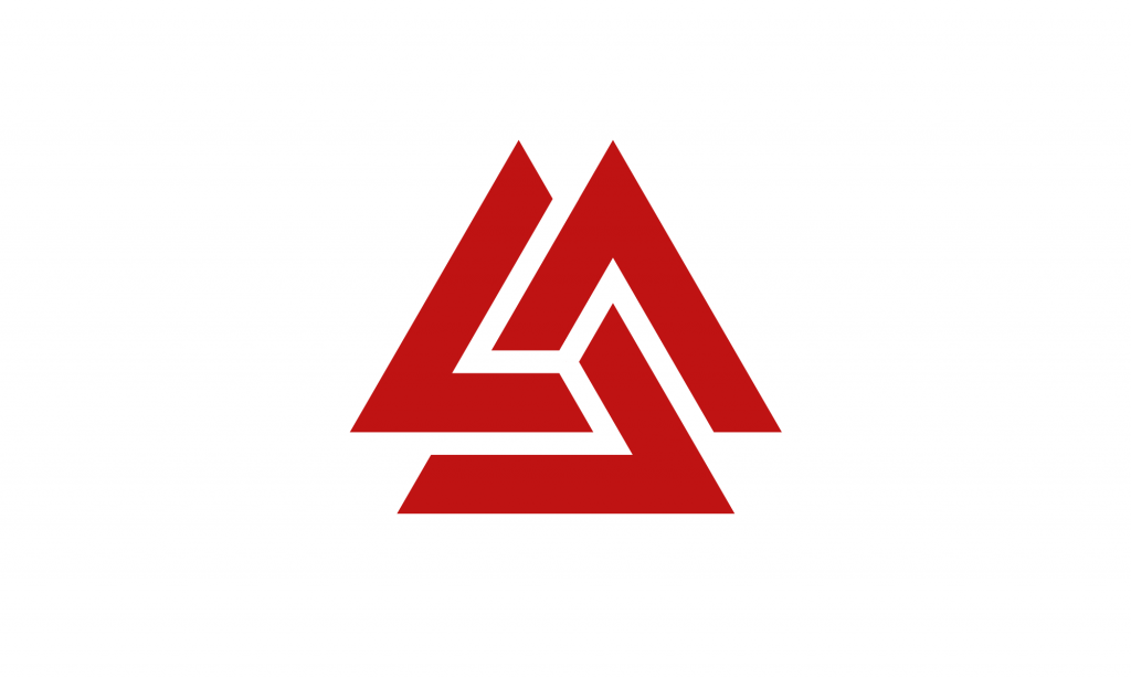
A few months ago I discovered the Valknut symbol. It’s a very angular trefoil knot – essentially a very sharp version of the Celtic Triquetra. (Or alternatively, it’s three linked triangles.)
It’s a very aesthetically pleasing symbol – combining the Power of Three with the mesmerising effect of an unending loop and un-untiable knot. It has rotational symmetry and is chiral.
And it’s an Anglo-Saxon and Germanic symbol (and it certainly does look very Anglo-Saxon). It’s part of English heritage. It’s unfortunate, therefore, that we don’t really see the symbol in modern life. (It’s part of a broader problem of our disconnect from the Anglo-Saxons. I’ve mentioned before that next to nothing – and sometimes literally nothing – about the Anglo-Saxons is mentioned in British schools. Most English people, I think, are completely unaware of Old English as a language – which is absurd as it’s a very nice language. Given all of this, it’s not surprising that this symbol has been forgotten about in modern life.)
So I think we should bring it back. It is a very nice symbol of the English and of Englishness, and it forms a very nice counterpart to the Celtic Triquetra (which is very well known about), given that they are just curved and angular versions of each other. (The Valknut probably needs a more English name – ‘Valknut’ is rather obviously Norse. I mean, really, it could just be called an ‘English Triquetra’, as ‘triquetra’ means ‘three corners’ – it being curved is not specified in the name. (Perhaps it could even be called a ‘Sexaquetra’ – ‘six corners’ – depending on how you want to count them – but that name doesn’t have as good of a ring to it.))
There are different ways of designing the Valknut – differences in line width and line spacing, and so on. And of course the distinction between the trefoil knot and the three linked triangles. In this post I present some designs, but I have not been exhaustive in these designs – yet – I might add more later. The style that I find to be most aesthetically pleasing is what I call the ‘close trefoil knot’ style, where the turns of the knot appear to leave almost no gaps – you’ll see what I mean if you look at some other designs. I’ve made these in a 5:3 ratio – which is a standard flag ratio – but that doesn’t really matter as they’re all just geometric shapes in the middle of a rectangle.
A blue on black design looks very nice – as does blue on dark grey, shown below. The blue I’ve used here is the same blue as from the Union Jack.
A blue on dark grey version – the blue is the same blue as from the Union Jack.
Blue on white also looks very good – quite minimalist, but pleasingly so.
A blue on white version – again, the blue is the same blue as from the Union Jack.
Red on black looks a little harsh, and red on dark grey is nothing special, but red on white is very pleasing.
A red on white version – this is the same red as from the Flag of England – the St. George’s Cross.
This uses the same red as from the English flag, so it makes a nice companion to it.
As I say, it would be nice to see this symbol used more widely. I think it would look very nice on British bank notes and coins. Similarly it would look great on rings and pendants. Symbolically it ties together so many things – the Anglo-Saxons and their Germanic origins, the Celtic Triquetra and Celtic knotwork, even things like the Triskelion (with Greek and Roman significance) and the Flag of the Isle of Man – it even has a passing resemblance to the symbol for the Deathly Hallows from Harry Potter. It links together many different things from thousands of years of English and British history. It could even be said to represent the three nations of Great Britain – the English, the Welsh, and the Scottish – should we so choose.
So I will try to use it more. Even just as a stamp or a sticker it’s very nice – or a background pattern. As a symbol it is simple enough, meaningful enough, and pleasant enough to be used excessively and not become tired or cliché.