A Flag of the English – The White Dragon Flag

I have always been tremendously jealous of the Welsh flag. It’s got a dragon on it – it looks fantastic.

The English flag, by comparison, is rather plain – a red cross on white. Plainness is generally quite a good thing in flag design – it means the flag is easily recognisable and easily reproducible. But still – who doesn’t want a dragon? Dragon flags look fantastic. The flag of Bhutan has a dragon on it, and it looks amazing. The flag of the Qing dynasty also had a dragon on it, and that looks even better – a truly outstanding flag design – much better than the current Chinese flag – they should consider going back to it.

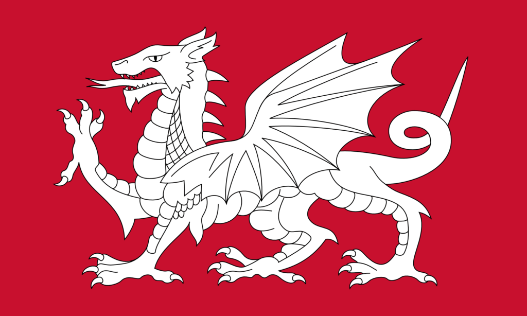
Why can’t we have a dragon on our flag? Well the thing is … we could. The symbolism of the red dragon on the Welsh flag goes back to Arthurian legend. A red dragon and a white dragon are locked in combat, with the red dragon representing the native Britons (the Celts) – now the Welsh – and the white dragon representing the Anglo-Saxons – now the English. So a white dragon is a symbol of the English.

This is fairly well known – lots of people already know this, and lots of people have already had the idea of making a white dragon flag to represent the English. (I mean, you could argue the idea never went away from Anglo-Saxon times – the Kingdom of Wessex used a golden dragon as its symbol (still on the flag of Wessex today, though as a wyvern (the distinction being somewhat unimportant here)), and the flag of Somerset also features a dragon.) But the idea has not spread very far – partly I think just because of a lack of awareness of the symbol, but also because of a lack of good designs. A good design propagates on its own.

So for a while now I’ve thought it would be good to make some designs for an English White Dragon flag – an unofficial flag as an alternative to the St. George’s Cross.

The simplest thing to do is just to change the colours on the Welsh flag, as shown below. (I am most certainly not the first person to do this – you can see that others have already done it just with a quick internet search.)

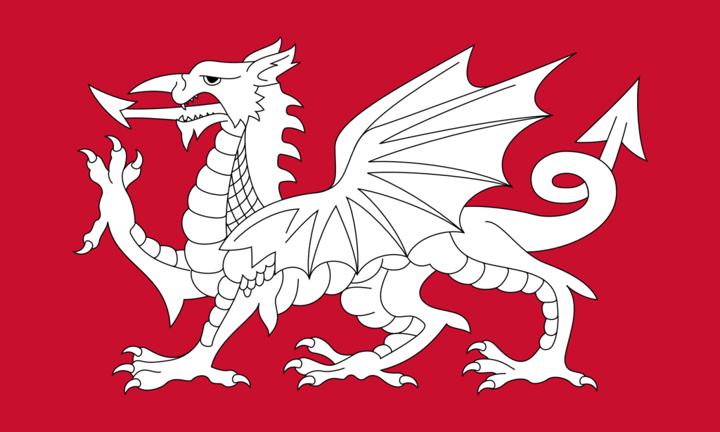
This is the exact same design as the Welsh flag – it just uses the red of the dragon from the Welsh flag as the background, and then the dragon itself is pure white. The design is incredibly striking – I think actually even more so than the Welsh flag.

This design also looks fantastic with a black background.

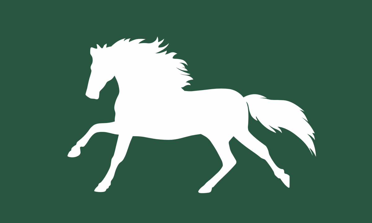
As with my design for a flag of Wiltshire (featuring a white horse), I find myself torn between different styles of illustration. The dragon on the Welsh flag is obviously very stylised – it’s not just a dragon, it’s a heraldic dragon. I particularly like heraldry and I quite like the heraldic style of illustration, but I do think there are some things that are a bit odd about the design here.

I have never liked what I call the ‘demon’s tail’ style of tail that the design above has. Almost every cartoon drawing of a demon has a tail like that. Personally I think it would look better if it were more naturalistic. That goes for the dragon’s tongue too.

I have also never liked the ‘nose horn’ of the dragon. This seems like a rather odd place to have a horn (that is, a forward-pointing one). In more naturalistic depictions of dragons – which are rather common nowadays thanks to CGI – you never see this. (It’s a remarkable thing that, with decades of stories and movies about dragons, we now have a very strong collective understanding of what a dragon is supposed to look like.)

So I set about modifying the above design. The result is below.

As with my design for a white horse flag for Wiltshire, I found that there were so many things to agonise over while making this design.

I wanted to make some improvements to the design, but I also wanted to retain much of the style – the heraldic style – of the original design. Of course, here we’re not dealing with a purely mathematical design – we’re dealing with freeform paths that can be given any shape. Should this control point go here? Should I move it slightly? Is that a better curve? That looks good, but does it deviate from the style too much? I agonised for hours and hours over it. I am not really certain about most of it, but at some point you just have to decide that it’s done.

I have removed the ‘demon’s tail’. I have also changed the tongue. Now, I’ve given it a forked tongue – that’s sort of a bit of a problem because of course a forked tongue typically carries the symbolism of the snake and of deception. That’s not the intended meaning here, of course – the aim is just to be naturalistic.

I have removed the nose horn, and elongated the dragon’s face. I think this is a tremendous improvement – again, more naturalistic – but of course it does lose some of that heraldic style. I have changed the eye quite substantially – making it a bit meaner. The eye on the original design makes the dragon look a bit dopey. I have also adjusted its spines – and I think this is the only change that I’m completely sure of.

There are so many other things I could have changed (adding more spines along the tail, changing the wings to be a bit more anatomical, changing the ears to look a bit more reptilian, and so on), but of course that risks losing some of the style. As with my white horse flag for Wiltshire, I consider this to just be Version 1 – I may make other versions in future with more modifications. I would also like to make some versions that don’t use the heraldic design at all – and which use something a bit more ‘modern’, for lack of a better word.

So we English can have a dragon on our flag, and it looks rather good. As ever, I don’t suggest making this the official flag – it’s just nice to have as an unofficial one. I’ll be getting some of these made for myself.

A Flag of Wiltshire – A White Horse on a Green Field

I was born in Wiltshire, and I have lived in the county for the majority of my life. I have a very long ancestry here – I can trace my ancestry back over 400 years in just one town. (And it certainly goes back further than that – 400 years is just what I’ve been able to trace.) Various branches of the family tree spread out across the county.

There is, if you didn’t know, an official flag of Wiltshire. All (or at least most – I haven’t checked) of the English counties have flags. The Wiltshire one was designed in the 2000s by Mike Prior. I’m not overly enthusiastic about the design: curved green and white stripes, with a green circle in the middle and a golden great bustard (a bird native to Wiltshire) on top. (I like the great bustard, but I just don’t quite like the shapes in the rest of it.)

I’ve known for a while that there has been an alternate flag design – an unofficial one. It features a white horse on a field of green. It is a reference to the many white horse figures that can be seen on hillsides throughout the county – Wiltshire has the most white horses of any county. This seems like a much more fitting symbol of the county than stripes and the great bustard. (Of course, Wiltshire doesn’t have the Uffington White Horse figure – the original, prehistoric white horse figure, which is about 2000-3000 years old. That’s in Oxfordshire, in the Vale of the White Horse. But that hill figure is less than 10 miles away from the border of Wiltshire – the Vale of the White Horse itself bordering Wiltshire, of course.)

This unofficial white horse flag was apparently also designed in the 2000s, by Chris Fear. While I like the idea of a flag of Wiltshire featuring a white horse, I’m not too enthusiastic about this specific design either. It’s based on the Cherhill White Horse – which is a white horse hill figure that’s located in the county. But that hill figure looks a little peculiar – in fact it almost looks more like a deer than a horse. Symbolism is extremely important (in flags, but also in anything artistic), but I think a bit of creative licence is also valuable in order to make a design that’s really distinctive (and, with luck, iconic).

So recently I’ve been thinking: why not make a new design? A new design of a white horse on a green field, but one which is a bit more … horsey – and, dare I say, dramatic … expressive …

It’s taken me a while to get round to doing it, but now I’ve done it, and the design is below.

A Flag of Wiltshire – The White Horse Flag – Version 1

I found this very difficult to do. There were many choices to be made when making the design. What pose should the horse be in? How stylised should the design be? How detailed should it be? What colour green should I use?

I decided to have the horse running. Most of the hill figures show the horse standing, but I think that’s not quite dramatic or exciting enough for a flag. A horse running looks quite majestic.

Flag design – particularly flag design for English counties – is connected to, or even part of, heraldry. Heraldry has its own conventions and style. When drawing animals in heraldry (well, when drawing anything, really), there’s a certain style to how its drawn. It might have been nice to do that here, but I’m not sufficiently well versed in that style to be able to do it. In fact, I’m not sufficiently well versed in any style to be able to make a stylised illustration. So the design is very literal, and flat. There’s a danger that that can make something look a bit corporate (and looking corporate must be avoided at all costs), but I think the result is a simplicity that is easy to recognise, and easy to replicate. I have heard that a good flag design should be something that a child could draw from memory by hand.

Lots of flags nowadays – particularly country flags – have mathematical specifications for how they should look. It’s easy to see why countries do this – if the design is specified mathematically, there can be no arguments about whether any one copy of the flag is correct. Doing this is much easier with geometric designs, of course – it’s quite easy to do this with the Flag of England, the Flag of Scotland, the Union Jack, and countless others. But this kind of mathematical specification is somewhat at odds with traditional heraldry. In traditional heraldry, figures and shapes are defined descriptively, not mathematically, and colours are certainly not defined in a universal way. The design is allowed to vary. With the design above, any number of small changes could be made to the outline of the horse without it looking substantially different, so this kind of flag naturally resists mathematical definition. In some ways that’s a good thing – it puts the flag a bit more in line with traditional heraldry – but in some ways its a bad thing – it is hard (or impossible) to replicate the design exactly unless you have the original.

The horse figure on the flag is, of course, pure white. Choosing a green was difficult. When you really get into it, green is actually quite a difficult colour. There are so many different hues and shades of green, and they all carry with them their own connections, meanings, and moods. The exact green that I’ve chosen here has a hue of 150, a saturation of 35, and a lightness of 25. That makes it a bluish green (which I generally prefer myself, but which I think also has a very classic look to it). To me it is reminiscent of wet grass or foliage in autumn or winter. It is a deep, retreating green suitable for one of the most rural counties in the country.

While I like this design, I am not entirely convinced that it is what I intended when I set out on this project. Perhaps I would prefer something different? Perhaps there are slight refinements that I could have made, but which I overlooked? I can spend forever and a day contemplating designs like this and still not come to any conclusions about them. So rather than have this thing sit on my computer for years while I ponder it, I’m just going to label this one ‘Version 1’, and if I decide that actually I want to do something differently, I’ll come back later and do a version 2, version 3, and so on.

I do not intend for this flag to necessarily replace the existing official flag. I simply wanted to have the design, and allow other people to have it as well. How can we know what flag design we really want unless we have some options to choose between? I’m a huge fan of having unofficial versions of things that exist alongside the official versions – unofficial national anthems (like Rule, Britannia! and Land of Hope and Glory), unofficial national symbols – and in this case unofficial flags. We don’t just have to have one thing, the official thing.

So this is Version 1. I may come back later and make some different versions, but I think this version is simple, yet elegant, and majestic – distinctive, easily recognisable, and easy to like. I’ll get a few made for myself.

(Lots of information can be found on the existing official and unofficial flags here: https://britishcountyflags.com/2013/07/31/wiltshire-flag/ .)

Valknut Flags

A few months ago I discovered the Valknut symbol. It’s a very angular trefoil knot – essentially a very sharp version of the Celtic Triquetra. (Or alternatively, it’s three linked triangles.)

It’s a very aesthetically pleasing symbol – combining the Power of Three with the mesmerising effect of an unending loop and un-untiable knot. It has rotational symmetry and is chiral.

And it’s an Anglo-Saxon and Germanic symbol (and it certainly does look very Anglo-Saxon). It’s part of English heritage. It’s unfortunate, therefore, that we don’t really see the symbol in modern life. (It’s part of a broader problem of our disconnect from the Anglo-Saxons. I’ve mentioned before that next to nothing – and sometimes literally nothing – about the Anglo-Saxons is mentioned in British schools. Most English people, I think, are completely unaware of Old English as a language – which is absurd as it’s a very nice language. Given all of this, it’s not surprising that this symbol has been forgotten about in modern life.)

So I think we should bring it back. It is a very nice symbol of the English and of Englishness, and it forms a very nice counterpart to the Celtic Triquetra (which is very well known about), given that they are just curved and angular versions of each other. (The Valknut probably needs a more English name – ‘Valknut’ is rather obviously Norse. I mean, really, it could just be called an ‘English Triquetra’, as ‘triquetra’ means ‘three corners’ – it being curved is not specified in the name. (Perhaps it could even be called a ‘Sexaquetra’ – ‘six corners’ – depending on how you want to count them – but that name doesn’t have as good of a ring to it.))

There are different ways of designing the Valknut – differences in line width and line spacing, and so on. And of course the distinction between the trefoil knot and the three linked triangles. In this post I present some designs, but I have not been exhaustive in these designs – yet – I might add more later. The style that I find to be most aesthetically pleasing is what I call the ‘close trefoil knot’ style, where the turns of the knot appear to leave almost no gaps – you’ll see what I mean if you look at some other designs. I’ve made these in a 5:3 ratio – which is a standard flag ratio – but that doesn’t really matter as they’re all just geometric shapes in the middle of a rectangle.

A blue on black design looks very nice – as does blue on dark grey, shown below. The blue I’ve used here is the same blue as from the Union Jack.

A blue on dark grey version – the blue is the same blue as from the Union Jack.

Blue on white also looks very good – quite minimalist, but pleasingly so.

A blue on white version – again, the blue is the same blue as from the Union Jack.

Red on black looks a little harsh, and red on dark grey is nothing special, but red on white is very pleasing.

A red on white version – this is the same red as from the Flag of England – the St. George’s Cross.

This uses the same red as from the English flag, so it makes a nice companion to it.

As I say, it would be nice to see this symbol used more widely. I think it would look very nice on British bank notes and coins. Similarly it would look great on rings and pendants. Symbolically it ties together so many things – the Anglo-Saxons and their Germanic origins, the Celtic Triquetra and Celtic knotwork, even things like the Triskelion (with Greek and Roman significance) and the Flag of the Isle of Man – it even has a passing resemblance to the symbol for the Deathly Hallows from Harry Potter. It links together many different things from thousands of years of English and British history. It could even be said to represent the three nations of Great Britain – the English, the Welsh, and the Scottish – should we so choose.

So I will try to use it more. Even just as a stamp or a sticker it’s very nice – or a background pattern. As a symbol it is simple enough, meaningful enough, and pleasant enough to be used excessively and not become tired or cliché.

Threads vs. Twitter – The Jury’s In

I’ve been wanting to write this post for at least the last six months, so the jury’s been in for quite a while.

When Elon Musk bought Twitter, I was sceptical. I heard tales that he was compelling the remaining staff there to work extremely long days – introducing an extremely brutal culture. I don’t know how true this information was, and I don’t know how true it is now – maybe Musk has taken his foot off the pedal a bit – but I am very against this kind of culture at technology companies, and didn’t want to use a platform that was built by it. I had no intention of deleting my account – that makes it possible for someone else to take your username and impersonate you – I was just going to leave it there and not tweet very much.

Conversely, when Threads was created I was very optimistic. Being an author, I am naturally more inclined to social media platforms that are word-based, rather than those that are image-based, like Instagram, or video-based, like YouTube, and I hoped that Threads could be all of the things that Twitter hadn’t been over the years.

It is almost two years since Threads was released, and the jury is in. Threads is absolutely shit, while Twitter has become possibly the best social media platform on the internet.

Even within the first few days of Threads being released, I could see that those people who were famous, or who already had large followings elsewhere, were able to get much further ahead on the site than anyone else, replicating and reinforcing the kind of celebrity-non-celebrity class structure that existed on Twitter prior to Musk buying it. What’s the point of starting a new social media site if you’re just going to do that again?

But that was far from the worst of it. One of the worst things about Threads is that it appears to be filled with absolutely insufferable cunts. Sometimes I will post something incredibly mild – almost banal – and I will get random people from across Threads – people I don’t know, people I’ve never interacted with, people I don’t even have common interests with – going on a crusade against it. And the most obnoxious instances of these are when they decide to ‘quote’ (or whatever it’s called on Threads) the post, complaining about it, rather than saying anything directly in response – as though to say ‘Look!!! See this disGUSTing thing this person has said!!! What a disGUSTing person!!!!!’.

It’s difficult to decide which aspect of this is most obnoxious. When I see a post online that I disagree with, if it’s by someone I don’t know or someone who isn’t generally well-known, I just ignore it and move on. It’s the refrain that sane people have been saying since the start of the internet: ‘You can always just not watch it / not read it.’. Why is Threads filled with people without this ability? But just as obnoxious is that it is an insane way to interact with someone you don’t know and have never interacted with before. You would never do this in real life.

Related to this is that Threads seems to be filled with people who are surprised that they will be blocked if they are cunts. If someone is acting high-and-mighty, and rather cancel-y, over a very mild post, I will block them. And yet endlessly these people say ‘uGH!!! I can’t beLIEVE that OP blocked me?!?!?! i GuEsS tHaT sHoWs ThAt He DoEsN’t ReAlLy HaVe An ArGuMeNt!!!1’ – no, it’s because you’re being a cunt – and you’re still being a cunt by discounting the possibility that your very obviously cunty behaviour might make people think that you’re a cunt.

But possibly even more annoying about Threads is that the algorithm has a very obvious left-wing bias. I mean it’s more than that – it’s a woke bias. If you post woke shit on Threads, you will do well; if you post anti-woke stuff, you will not do well. You can see how many views a post gets on Threads, and I can tell, before posting something, whether the algorithm will like it and boost it, and how high that view count will be. Oh, you used a swear word? Demote. Oh, you referred to something from traditional culture? Demote. Oh, you talked about how you didn’t like something? Disliking things is hatred, and we don’t allow hatred in our hugbox. Demote. Oh, you suggested that there’s a right and a wrong way to do something? That makes people feeeEeEel bad. Demote. Meanwhile it will push the sloppiest slop from content farms in Vietnam to millions of people.

Twitter, on the other hand, has gone from strength to strength. There is endless self-congratulatory consternation from mainstream media types and Leftists these days about how Twitter is ‘oooooh it’s … it’s a very dark place now … it’s … there’s … there’s a lot of “””hateful””” stuff on there’. Quite frankly anyone who says this has either become so used to their mind being numbed by the fluffy, microfibre cushions of moderation that exist on other sites, or they don’t use Twitter.

Are there some awful people and awful opinions on Twitter? Yeah. D’you know what you do about it? You just ignore it. You keep scrolling. You don’t, in fact, have to absorb every opinion you see. If you think otherwise, that suggests that you are lacking in a vital cognitive ability – and your lack of ability to form your own thoughts is not a justification to limit what the rest of us can do.

Twitter is the Wild West. You’ll find crazy people there, idiots, and some people who are just downright evil. But guess what? You find all of that on Threads too, but it’ll only be the crazy, idiotic, and evil from the political left. What you’ll also find on Twitter is some of the greatest insight and in-depth discussion you’ll find almost anywhere on the internet. You won’t find that on Threads, or Instagram, or Facebook, or Reddit, or BlueSky, or in YouTube comments – all of which are heavily policed by wokescolds and whingelords – be they biological or electronic ones.

You can tweet on Twitter knowing that it won’t receive more or less attention just because it has the ‘wrong’ ideological bias. You can see the analytics for a tweet on Twitter too – and Twitter shows you far more than Threads does – and you can easily see that the algorithm does not wildly vary how much attention it gives a tweet based on whether some super-Sharon thinks it has the right ‘tone’.

I was sceptical about the change to ‘verification’ on Twitter – making it so that anyone could buy it. But actually this change has been brilliant. The old system – where verification was for journalists, celebrities, and politicians – created a class structure on the site. If you were in the ‘verified’ class, you could actually use Twitter to promote things. If you were in the ‘unverified’ class, you were just the audience – you would never have any reach or say or influence – you were there simply to applaud and cheer on the exalted few. The new system is actually far more meritocratic.

I have also been impressed by how Twitter now will pay you to tweet, if you have a premium account. It was absurd that, for so long, Twitter and so many sites like it would make money off of your content without paying you. We do not accept this from YouTube, so why do we accept this from other social media sites?

Twitter is actually enjoyable to use. Threads is not. Threads is suffocating. You cannot do well unless you resign yourself to pushing endless multicoloured slop – but even if you did that, there would be no benefit anyway, since you don’t get paid, and you can’t put links out to other things on the internet because Threads will pummel those posts into the ground too. And at any moment, a haughty non-person may decide to make complaining about you to their three followers their life’s purpose just because you asked a question about the origin of a word.

So here we are, two years later. Threads is vile. It has no reason to exist. Twitter remains the champion.

The Book of the Order of Chivalry – One of the greatest books I have ever read

Almost every week nowadays, I marvel at the things not taught to me when I was in the education system.

It’s a common refrain – ‘Why aren’t they teaching this?’, ‘Why aren’t they teaching that?’ – but I mean it in an even deeper sense. It’s not just that there are certain things that are not taught – they’re not even mentioned. An example of this is Anglo-Saxon history. I was taught nothing about Anglo-Saxon history when I was in school. This is astonishing given that the Anglo-Saxons were the start of the English – all of the history of the British Isles before that is British history but not English history. But even more than that, in the entire five years I spent at secondary school, I don’t think the term ‘Anglo-Saxon’ was mentioned even once.

There are also many examples of things not being taught or even mentioned from my university education. I could write hundreds of blog posts (not an exaggeration) about how low quality my university education was – there’s no point trying to cover it all here. But in addition to many utterly bizarre choices in course structure, there were hundreds of important things that were never even mentioned. In physics we were not taught the conceptual framework around waves properly to understand radiation pressure or the derivation of the black-body spectrum curve; we were not taught Minkowski diagrams properly; we weren’t taught measurement and uncertainty properly. In mathematics we were not taught matrices properly, or the principles of limits. We didn’t even really do complex numbers properly, though we did do a lot with them. The way we were taught quantum mechanics was utterly abysmal. And we were taught absolutely nothing about the history of physics.

I could go on and on and on, but that’s not what this post is about. It is in the time since leaving the education system that I have learned about these things. Everything I know about Anglo-Saxon history – which, of course, went into the writing of On The Subject Of Trolls – I have learned myself.

If you have grown up in Britain around the same time as me (I am a millennial), you will have heard the word ‘chivalry’ thrown around from time to time. You of course know that it has something to do with mediæval knights – it was some sort of practice that they had or ideal that they strove towards. You will have heard the word ‘chivalry’ used to refer to certain kinds of behaviour in the modern age – usually things as drab as holding doors open for people. You will also have heard the word used by feminists. Over the last 30 years, they have typically used it in a derogatory sense, referring to actions or behaviours that they consider to be outdated and offensive to their belief system.

All of this – everything that has been said of ‘chivalry’ in popular culture in the last 30 years (at least) is wrong. Not only is it wrong, it is completely wrong. It doesn’t even get the basic ideas of what actual chivalry is right.

I have recently been reading a book on heraldry. This book makes reference to other works as it goes along, and at one point – quite early on – it describes a book called The Book of the Order of Chivalry. This book was written in the 1200s, and it describes exactly what chivalry was supposed to be, and what knights were supposed to do. I had no idea that there even was such a book. What’s more, The Book of the Order of Chivalry was apparently considered to be the standard text describing what chivalry was for a very long time. What an extraordinary thing – that there is a definitive text telling those who aspire to be knights what a knight was and what chivalry was!

When I saw this a few weeks ago, I was already complaining in my head of how this wasn’t ever mentioned to me while I was in the education system. I looked around online to see if I could read it – for old texts, very often you can read a scan of them somewhere online. I went onto Amazon to see if I could buy a modern copy of the book – and I could – there was a modern translation of the book available. (Not so modern as to be affected by the rot that is currently creeping through academia.) I bought it.

The Book of the Order of Chivalry is not a long book – in the translation that I have, it doesn’t even pass fifty pages. But when I was reading through it, it was nothing short of enlightening. And I don’t mean that in an exaggerative sense – reading it was as though the light of knowledge was shining into my mind.

Chivalry is an entire system for producing persons of good character – persons who are well trained in the various martial arts of a knight, and so are very physically capable, but who are also learned, and so very mentally capable. It is a system that, through the production of such persons, produces a good and orderly society. It also contains methods of self-regulation – necessary for when someone comes along who tries to subvert the system.

Although The Book of the Order of Chivalry was written in the 1200s and is specifically about knights, and those who wish to become them, many of the prescriptions it gives about how knights should be could apply to anyone, in any time period, who wants to be a good person or build a good society. That’s one of the things that was so fantastic about it – huge parts of it are completely relevant to life today. Some of it appears to be astonishingly prescient – there are problems that exist in the world today that this book has the solution to. And this is what makes it downright outrageous that this book has seemingly been hidden from us in the modern age – the solutions to many problems that exist today – sometimes very specific problems – have been known for centuries.

Take the following paragraph from the translation by Noel Fallows:

The king or prince who unmakes the Order of Chivalry itself not only unmakes himself as a knight, but also the knights who are subordinate to him who, because of the bad example set by their lord and so that they will be loved by him and follow his evil ways, do what does not pertain to Chivalry or its Order.

Ramon Llull, The Book of the Order of Chivalry

In other words, if any knight acts in a way that is not in accordance with true Chivalry, he not only unmakes himself as a knight, but also all of the knights he trains or is in command of.

This is a principle that is relevant not only to Chivalry, but to any organisational structure, in any time period.

Take another paragraph:

If the squire should be dubbed a knight because of fineness of features or a well-built, well-proportioned body, or because he has fair hair or carries a mirror in his purse […] you debase and diminish the Order of Chivalry.

Ramon Llull, The Book of the Order of Chivalry

What an amazing thing to read! Don’t just reward people with status and power because they are good-looking – it’s a principle that can apply to every society in every time period.

Take another one:

The prideful, ill-mannered squire who speaks and dresses crudely, has a cruel heart, is avaricious, mendacious, disloyal, slothful, irascible, lustful, drunken, gluttonous or perjurious, or who has other vices similar to these, is not suited to the Order of Chivalry.

Ramon Llull, The Book of the Order of Chivalry

To how many people does this apply today! Every week there seem to be more and more people who could be described in this way. And not only are they not suited to the Order of Chivalry, they are not suited to any position where they have any influence – particularly positions of cultural influence, which they seem to currently occupy.

Here’s another:

Do not seek nobility of courage in the mouth, for it does not always tell the truth, and do not seek it in resplendent vestments, for beneath many a resplendent cloak there is a base and weak heart filled with evil and deceit.

Ramon Llull, The Book of the Order of Chivalry

I would like to give more quotes from the book, but I fear I could very easily pass the threshold of fair use. This book is filled with good advice on how to be, how to act, how to live, how to learn, how to teach, how to train, who to trust, who to grant status, how society should be.

Chivalry – true Chivalry – is not just a few trite mannerisms – it is not just a set of pedantic rules for small actions. It is an entire way of life – and one designed to improve society. It is a tragedy that we have forgotten what it is.

It’s worth mentioning that Llull is adamant that you cannot be a knight unless you are a Christian – nothing truly chivalrous can follow without that. I am a staunch atheist. In the era of New Atheism, I was a more combative one (which was of course a big part of what New Atheism was), but nowadays I am not, and I find those who retain that combativeness towards Christianity to be rather cliché and tiresome now – it’s not needed anymore. So I can appreciate the value of the ideas in this book without being a Christian. At the same time, it’s interesting how Llull often writes about the importance of using reason and scientific knowledge (‘scientific’ perhaps not quite in the modern sense), and of avoiding superstition. Such ideas would have been very pleasing to the New Atheists of 2007-2012.

It is outrageous that modern popular culture – and modern feminism – lies to us about what true Chivalry is. It is outrageous that the modern education system does not tell us what it is. It is outrageous that the modern education system doesn’t even tell us about the existence of this book. And it is outrageous that wisdom that has been around for centuries is hidden from us – wisdom that we could use today.

Reading this book was enlightening – not because I didn’t know or believe many of the ideas that are in it – a lot of them are actually ones I already knew and agreed with – it was enlightening because I was realising just how long this knowledge has existed for. It was there. It was always there.

It was also remarkable just how much the ideas overlapped with ideas from another part of my life: Taekwondo. I have done Taekwondo for more than 20 years – it’s been a huge part of my life. Taekwondo has a moral dimension. What was amazing reading this book was how mediæval Chivalry (from Europe eight hundred years ago) and Taekwondo (which developed in Korea in the last century) have produced many of the same ideas. Two completely unconnected cultures produced the same ideas. Extraordinary.

True Chivalry is, in many ways, the antidote to the poison that is modernity. It is the balm that could heal many today. It is not something to be contemptuous towards – it is quite possibly the very thing that we, the English, need at this moment in time.

I have not shown you the very best part of the book – that should be saved for when you read it yourself. And I think you should read it yourself. There are very few books that I would say that everyone should read, but this is one of them. Every Englishman should read this book.

You can get the version I read here: https://amzn.to/3HDxmmT (affiliate link).


P.S. While I have tried to be very clear here as to the reasons why I like this book so much, in time the reasons will become clearer still.

Therapomania – The near-religious belief in the infallibility of psychotherapy

Rick and Morty was mid.

I seem to be one of the only people who has this opinion. Most people, it seems, either haven’t seen the show, or think it’s absolutely brilliant.

I actually didn’t see the show for many, many years. It was only last year, I think, that I watched it all. (Well, up to the end of season six – I dislike changes in voice actor.) I had tried to get into it several times previously – because people had said that it was a great show – but I just found the first three episodes unbelievably dull.

Having now watched it, I’m confused as to why people think it’s so outstandingly brilliant. The show is nowhere near as funny as I was expecting it to be based on what people said. (It is funny – it’s just not that funny.) It’s also quite slow – there is much that could have been cut out. I actually far more enjoy clips of the show as YouTube Shorts than the show itself, because the clips cut out the dead time. I’m concerned that people like it as much as they do simply because it is whacky. It’s off-the-wall; it’s random. It’s weird and it’s cool, and it’s cool that it’s weird. ‘Whackiness’ like this is actually quite easy to produce in an artistic work. (I think people think it’s hard to do, but it’s not.) And if it’s not paired with true humour or insight, it’s cheap.

Anyway, one of the tangents of the show that is quite funny, is that of the therapist character – Dr. Helen Wong. The idea of the Smith family going to therapy is intrinsically hilarious – partly because of the contrast between their space-faring, multidimensional lives involving the most grotesque, unsettling, and downright bizarre aliens, and the HR-style banality of psychotherapy, and partly because the problems the Smith family face are not ones that can be solved by psychotherapy. But the therapy scenes are also hilarious because of the way they mock the trite ruminations and kum-ba-yah-ism of therapy – in a way that dozens of shows have done before.

At the end of the episode of Pickle Rick, where Rick tries to avoid going to a ‘family therapy’ session by turning himself into a pickle, Rick stumbles into the therapist’s office, where the rest of his family (minus Jerry) have been sitting and being intellectually harassed by the therapist. Rick asks Beth to give him the serum that will turn him back into a human, which she has held onto for the entire episode. The therapist then directs Beth to ask Rick why he needs the serum, knowing that it will force him to say that he didn’t want to come to a family therapy session.

Rick ends up giving a monologue about why he doesn’t like therapy – most of which is correct. Dr. Wong then responds with a monologue.

Dr. Wong’s monologue is part psychoanalysis, part life-coaching speech. Her psychoanalysis of Rick is incorrect based on what we know from all the previous episodes of the show, and the monologue overall is incoherent – making points that do not logically follow on from each other – but it contains the kind of pretentious language and lilt that all successful life coaches use.

It’s actually quite funny, because it’s an excellent mockery of the kind of beatification that therapists, life coaches, business coaches, consultants, megachurch pastors, and certain influencers sometimes receive. Here is someone who has mastered the aesthetics and cadence of insight, while having absolutely nothing profound to say. Very funny.

This is how I understood this moment in the show when I first saw it – and how I thought everyone understood it. However, when I watch this clip on YouTube, and I scroll down to the comments, I am mortified to find that there are seemingly a large number of people – thousands of people, based on the likes – who treat this scene as actual, genuine, real psychotherapy, and Dr. Wong’s analysis of Rick as being nothing short of perfection in profundity.

This baffled me when I first saw it. How do these people not know that this is a joke? How do people not know that this is mocking the character of Dr. Wong? The entire setup for this scene is a textbook example of the humour of contrast – the extremity of Rick and Morty’s multidimensional life against the mundanity of a therapist’s office in a shopping mall. We have seen this kind of contrast humour – between the extraordinary and the mundane – hundreds upon hundreds of times in media over the last 25 years – how are these people not able to recognise it again here? But no, apparently these commenters believe that everything Dr. Wong is saying about Rick is absolutely true, and can be applied to real people in the real world.

It’s worth mentioning at this point that these kinds of comments on the video and the likes they have received may be entirely fake. I have noticed a change recently in the kind of comments that appear at the top of YouTube videos. They’re sort of all like this – right across YouTube, but particularly under comedy videos – people taking the content of the video far too seriously, as though it isn’t comedy. I’m not the only person who’s noticed this either – I recall that there’s even a Twitter account dedicated to overly-serious comments under Family Guy videos. In a world where it is possible to generate readable text very easily (AI), it is entirely possible that all of these comments are from fake accounts.

However, the reason why I am not entirely convinced that these comments are fake is because I have noticed a similar attitude towards psychotherapy in real people – either commenters on certain kinds of podcast or even friends in real life.

There is a common refrain that you will see right across the internet. It’s a kind of text-based meme. ‘Men will do anything except go to therapy.’, or some variation of that. You see this refrain anywhere that tells of or shows a man who has done something seemingly incomprehensible to the commenter.

A good 80-90% of the time I see this refrain, I think ‘Yes, because most men intuitively know that what’s done in “therapy” will have absolutely no capacity to solve this problem.’. There is an assumption, held by some people – a belief, even – in the infinite power of ‘therapy’ to fix everything. They seem to believe that therapy can fix every problem. I have even heard, over the years, these people express that they believe everyone should be in therapy – all the time.

As I say, the reason why therapy is less popular with men than it is with women is because men realise that it will not solve their problems. This is not to say that it is never useful – there are certain problems that it can solve – but psychotherapy is treated by some as a panacea. It is not. And not only is it not, it can also create problems. Psychotherapy can encourage excessive rumination and the acceptance of non-agency – and even worse, the near-worship of psychotherapy that seems to exist among a small proportion of the population can promote both of these things.

Psychotherapy is not neutral. We are encouraged to think that it is – that the psychotherapist comes with no biases. But actually they do – and sometimes they have very strong biases. Psychotherapy is not neutral – not morally, not philosophically, not politically. They have replaced, in some ways, a task done in previous centuries by vicars and other religious figures – except that while you likely know the approximate moral, philosophical, and political positions of a Christian vicar before talking to them, with a psychotherapist, you don’t.

Psychotherapy is not infallible. This should be obvious, but apparently to some it is not. One of the clearest and most topical examples of this is the complete capture of the profession of psychotherapy by Gender Ideology that we have seen over the last decade or more. When an entire field can make that big of a mistake, one should not only not consider it infallible, one should consider it to be highly fallible.

Yet there are people who seem to believe in the complete infallibility of psychotherapy. More than that – they won’t have a word said about it. If you try to suggest that maybe – just maybe – psychotherapy is anything other than salvation, they will try to shut you down – cut you off mid sentence. No wrong word may be said about it. It is a religious-like zeal, and I have observed it enough times now to need a name for it.

Psychotherapomania – or just therapomania for short – the near-religious belief in the infallibility of psychotherapy.